Need a creative partner
for your next big idea?
Unified Esports Association
Leveraging teamwork to achieve an epic win
Background
Unified started as a few university students who loved video games.
That love turned into shared conversations about games, which turned into an idea to create a better structure and community for players, which turned into countless volunteer hours building what became Midwest Esports.
At the same time, the prevalence of esports was increasing. More leagues, conferences, associations, and festivals began to emerge. The nimbleness of the Midwest Esports team led to their acquisition of several leagues and associations in the area, as well as multiple new products under a brand called Unified Esports Association.
Then came 2020.
The shutdown of in-person events sent gamers searching for alternatives online, and UEA’s popularity skyrocketed. The growing pains caused by the pandemic sent the burgeoning conglomeration of entities searching for some help to bring not only their players but also wider corporate audiences under one recognizable banner.
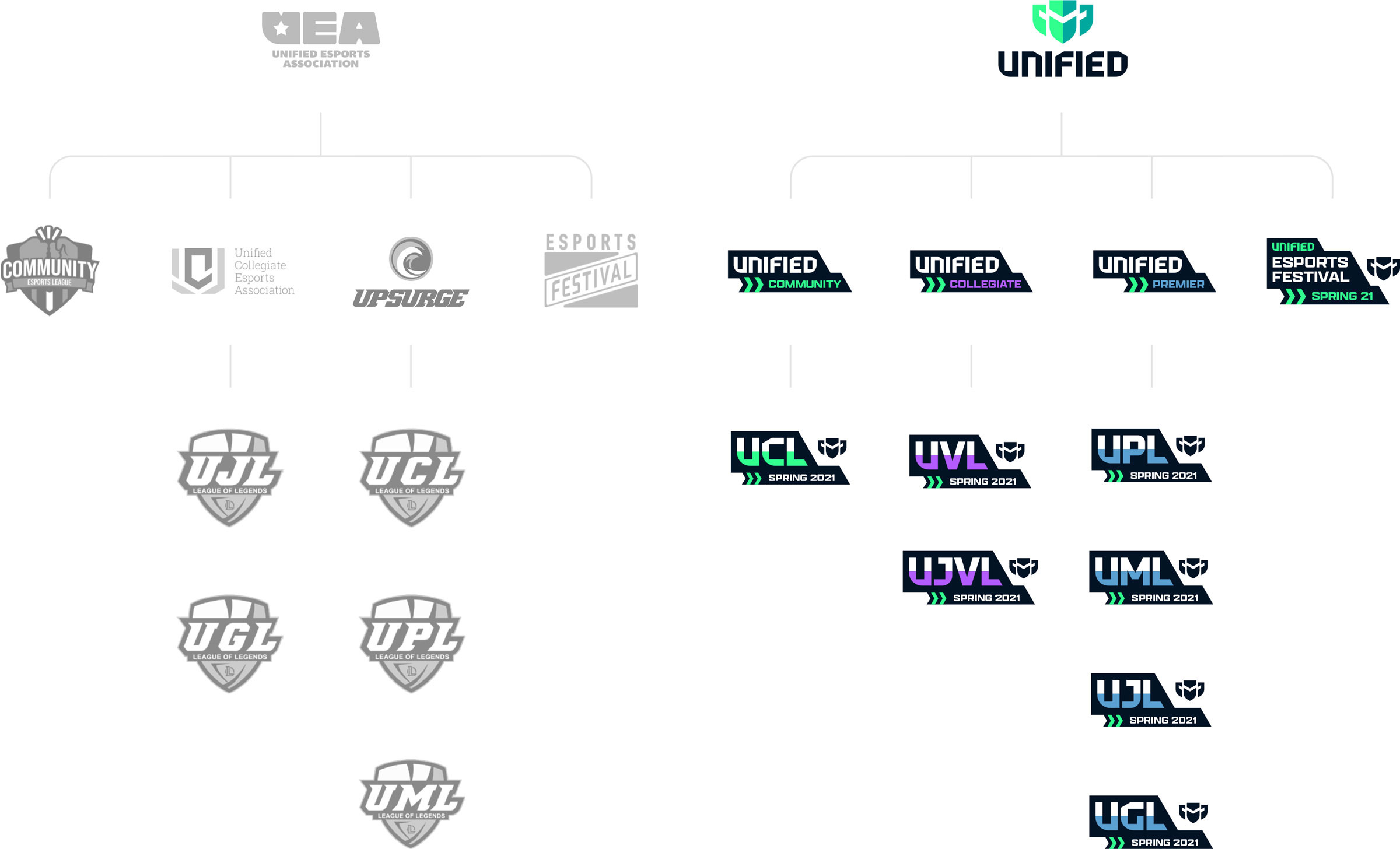
Nomenclature & Brand Hierarchy
So the first order of business was finding a name that would be appropriate and serve as one umbrella for everything.
They needed a distinct fit that would be clear and could offer leeway in the overarching structure. We evaluated many options, but ultimately, the right solution was to simplify what already was—bringing all the players and entities together under the name “Unified.”
Underneath the parent, Unified’s disparate products and leagues were missing a big opportunity. There wasn’t a natural progression for players as they grew from one level of competition to the next. A considered, clear hierarchy of leagues built needed cohesion across the board.
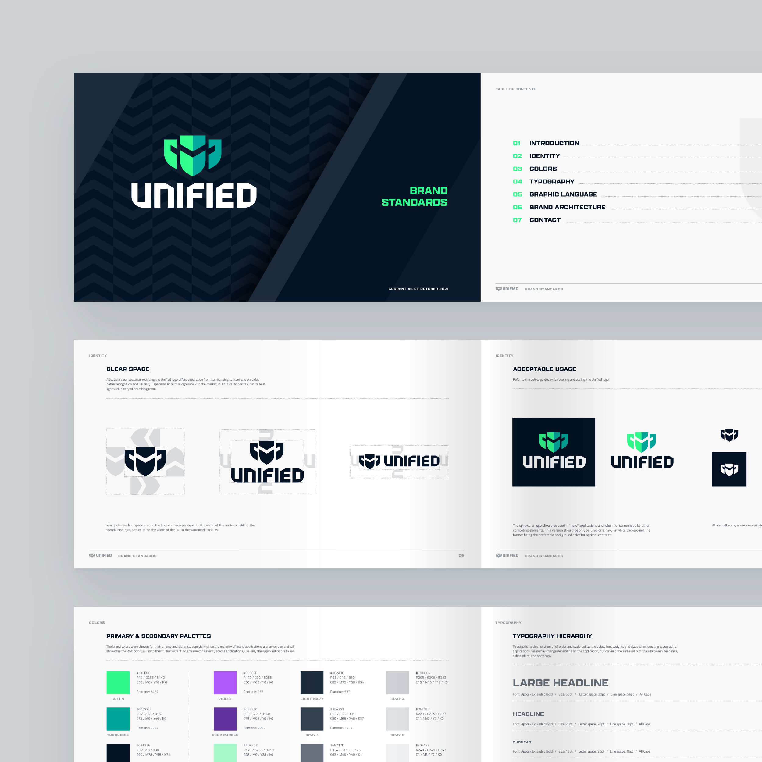
Identity Design
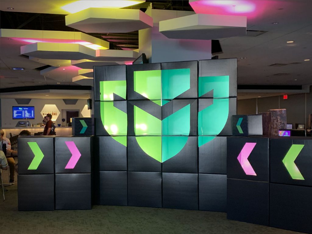
In the identity design, we pursued a fitting paradox to characterize Unified’s essence—unity and competition.
The logo illustrates this duality by positioning two silhouetted faces that both face off and also, with a subtle shift in perspective, shows team strength united behind the central shield. The chevron shape in the central shield becomes a visual wielded throughout the brand in patterns and accents.
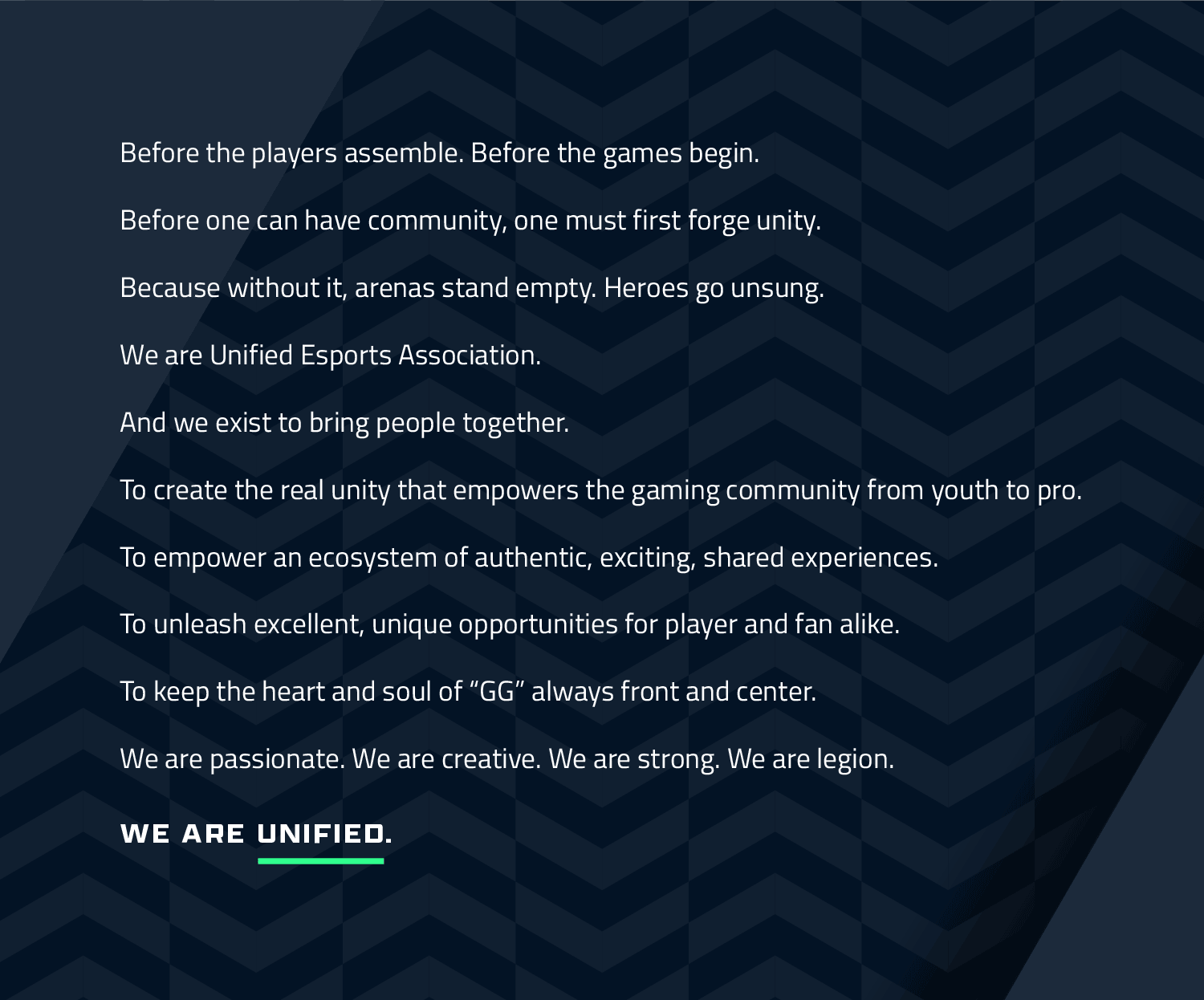
Brandifesto
Then came the need to arm brand ambassadors with a vision, an energy, and rallying cry for the new brand. We call this a “brandifesto.”
The brandifesto is an internal document which sets the stage for all of an organization’s stakeholders and supporters. It casts vision and provides energy through its simple-but-profound explanation of the brand’s purpose. It describes the beating heart and soul of what makes the brand. Getting this crucial anchor piece correct is imperative as it serves as the springboard for all the creative pieces in the brand language.
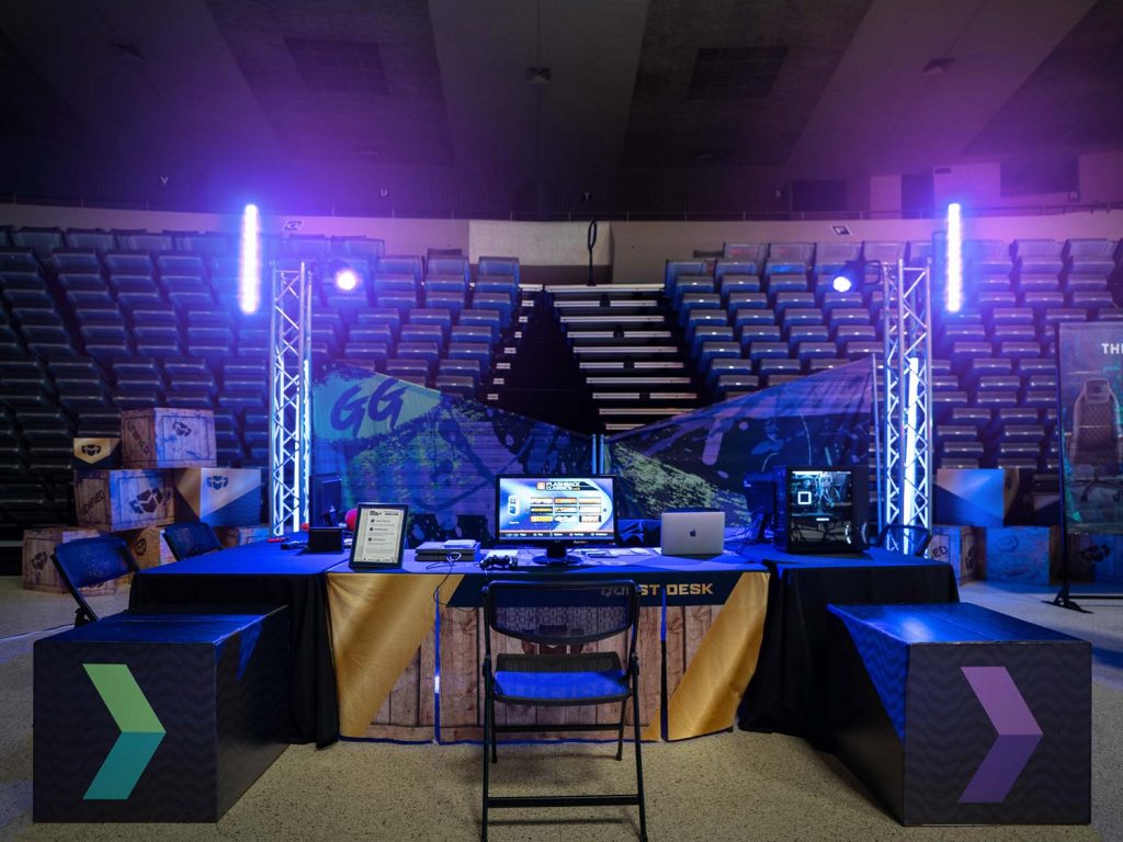
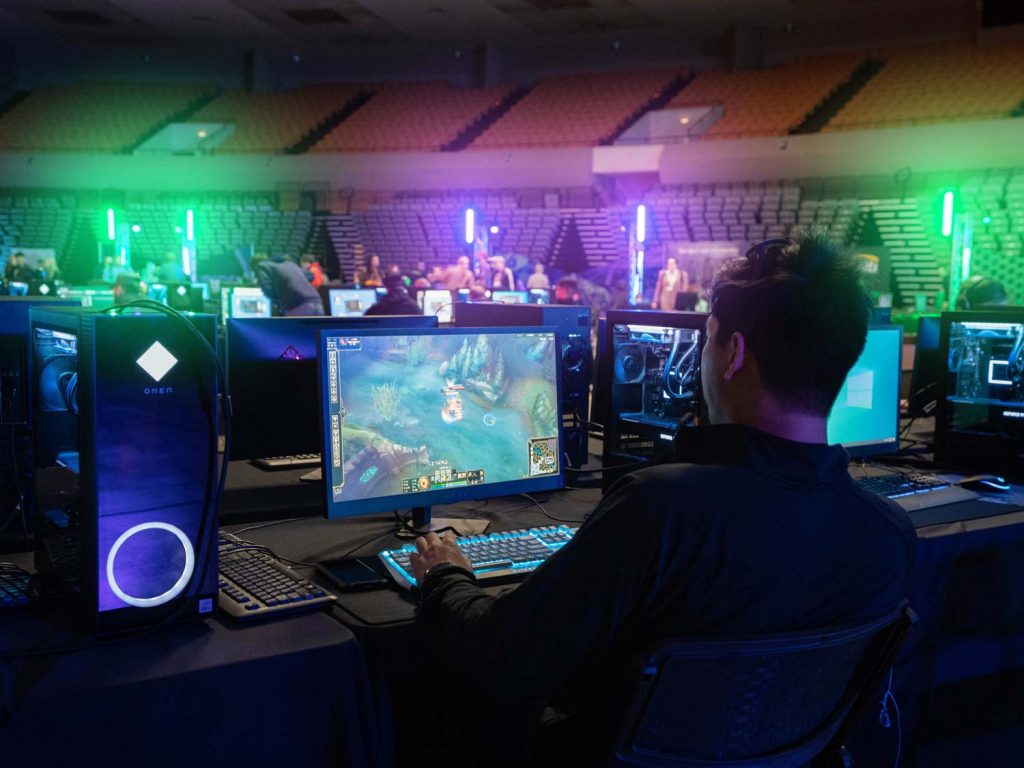
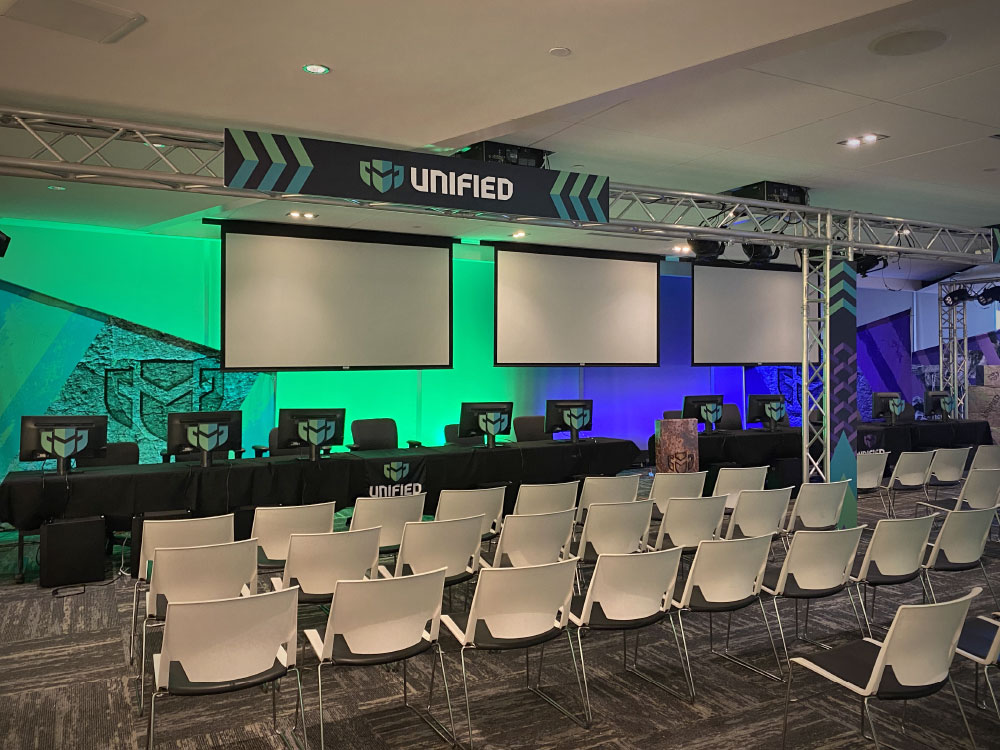
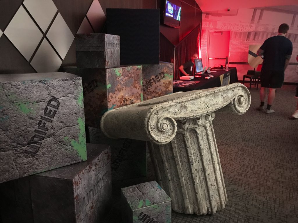
Environmental Design
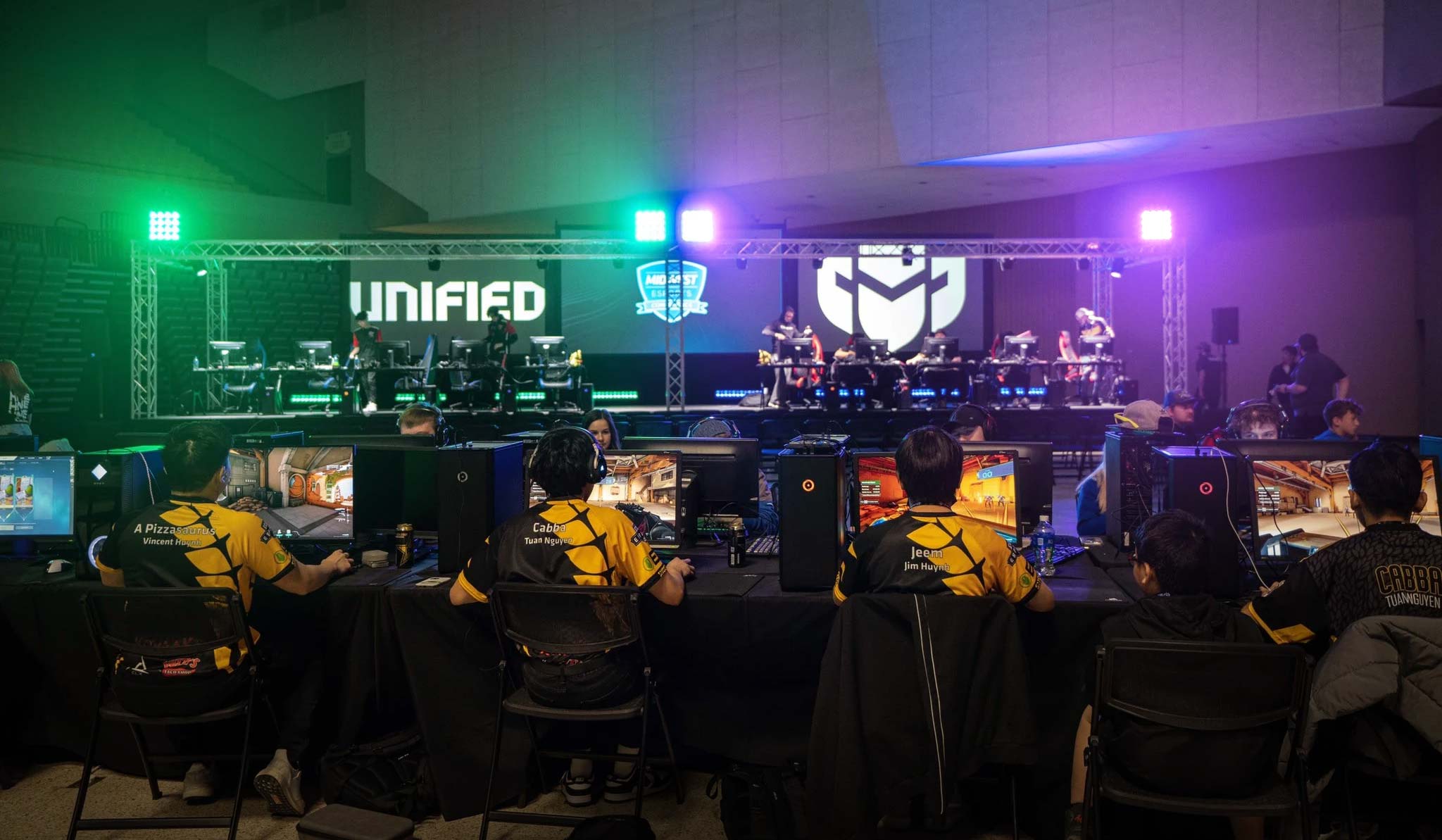
Unified’s reopening of their signature Esports Conventions proved to be an epic task, due largely to their sheer increase in size resulting from the immense pandemic growth. We worked alongside an experienced and talented event planner for idea generation, creative design, fabrication, and meshing all the pieces. Our efforts truly paid off for the 2021 conventions, building an immersive ambiance of a world that was unlike previous e-sporting events.
Results
A cohesive brand identity and branding tools gave Unified the ability to harness the explosive energy of the company’s dramatic growth and unify its dedicated fan base.
“The Unified rebrand aligns so incredibly well to our company values, and has been crafted around our community, competitions, and champions perfectly.”
Ramsey Jamoul, Unified Esports Association CEO