Need a creative partner
for your next big idea?
Alzavino Wine Tavern
Stealing the affection of wine enthusiasts
Born out of their love for traveling and experiencing vineyards abroad, Ken and Danielle Harmon had dreamed of opening a wine bar. A place where people could come and not just sample good wines, but share an experience. And bring it a little closer to where they call home—Wichita, Kansas.
They approached Gardner Design knowing they would need help designing a space that looked, functioned, and felt all the things in their mind. Friendly and approachable. Sophisticated, rich, and unique. They were getting ready to introduce something completely new to the Wichita area.
Nomenclature
The first step we took was to land on the perfect name. With a blank slate in front of us, we brainstormed pages and pages of names. And then, like a fine wine connoisseur, we narrowed our list down to the few that had the most potential. Each idea had a theme that could be planted to grow into the brand’s story and identity.
One name borrowed from an instrument traditionally used to taste batches of wine, a wine thief, or as they say in Italian, Alzavino. The Harmons fell in love with the name and opened up a playful potential for the brand.
Identity Design
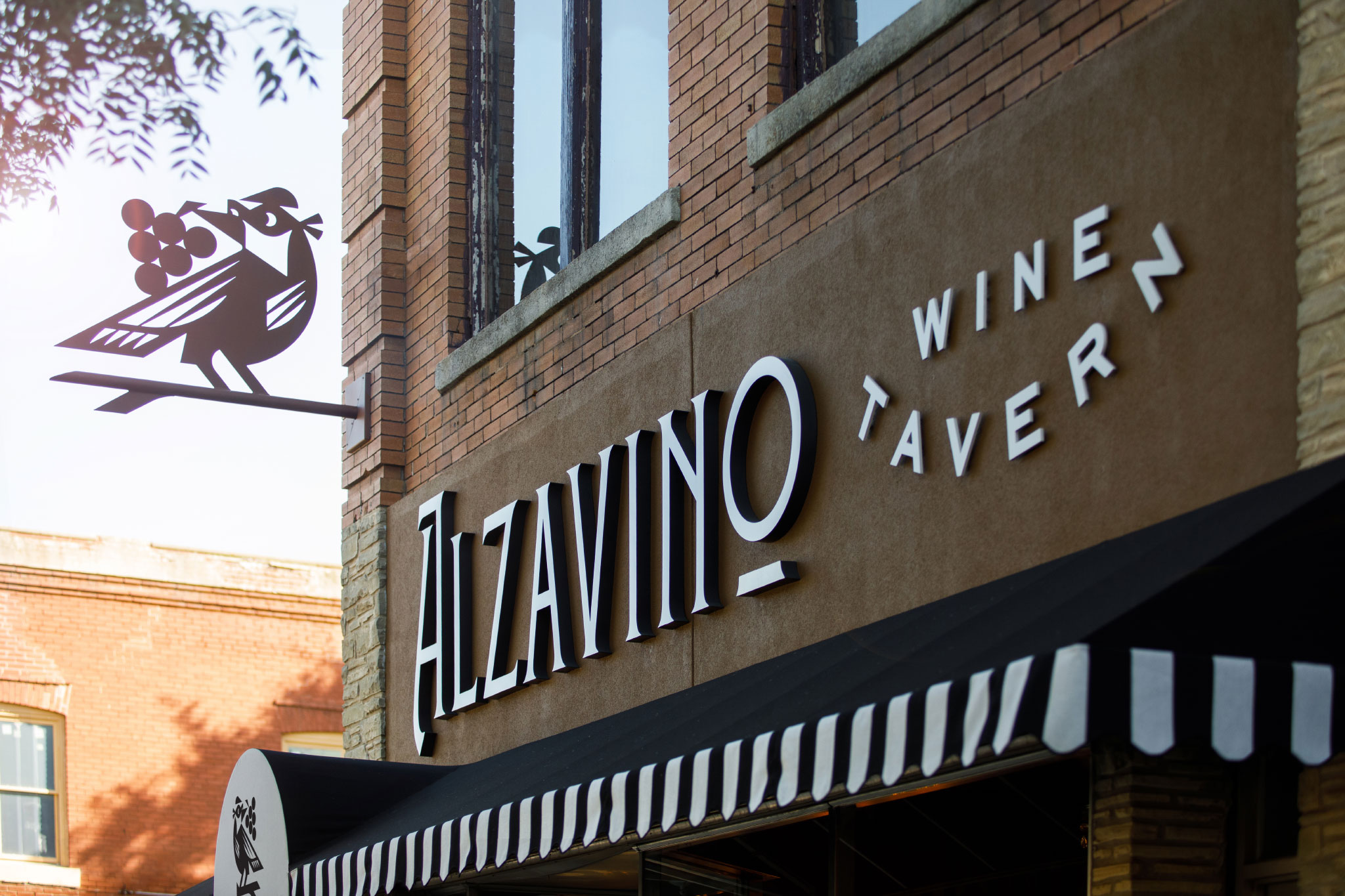
We took cues from the Alzavino name as we created various arches on the story. Starting with simple sketches, designer Adam Anderson iterated through images of a wine thief and cask, to a masked bandit, to a grape-stealing bird in the vineyard. We pulled together several options that we felt best told the story but still had chapters left to be written.
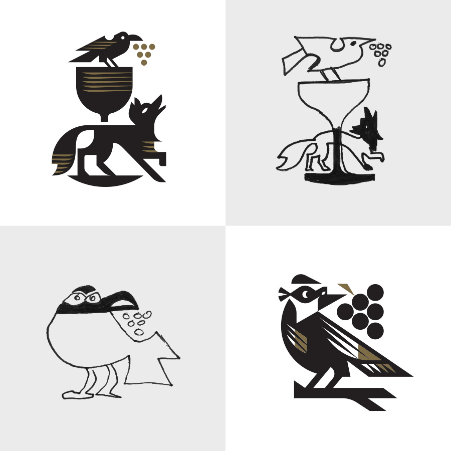
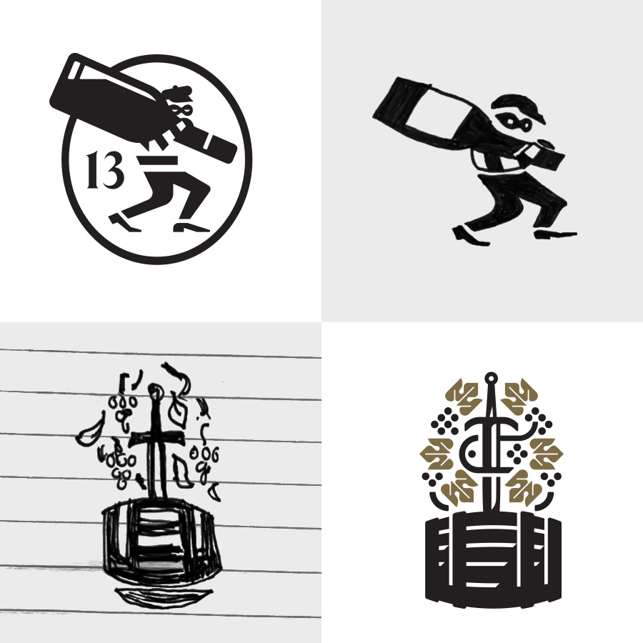
We worked it to perfection with fun-lovin’ word associations and ideas that could be pulled into the logo design and brand identity. In the end, Ken and Danielle chose the bird bandit.

Brand Language
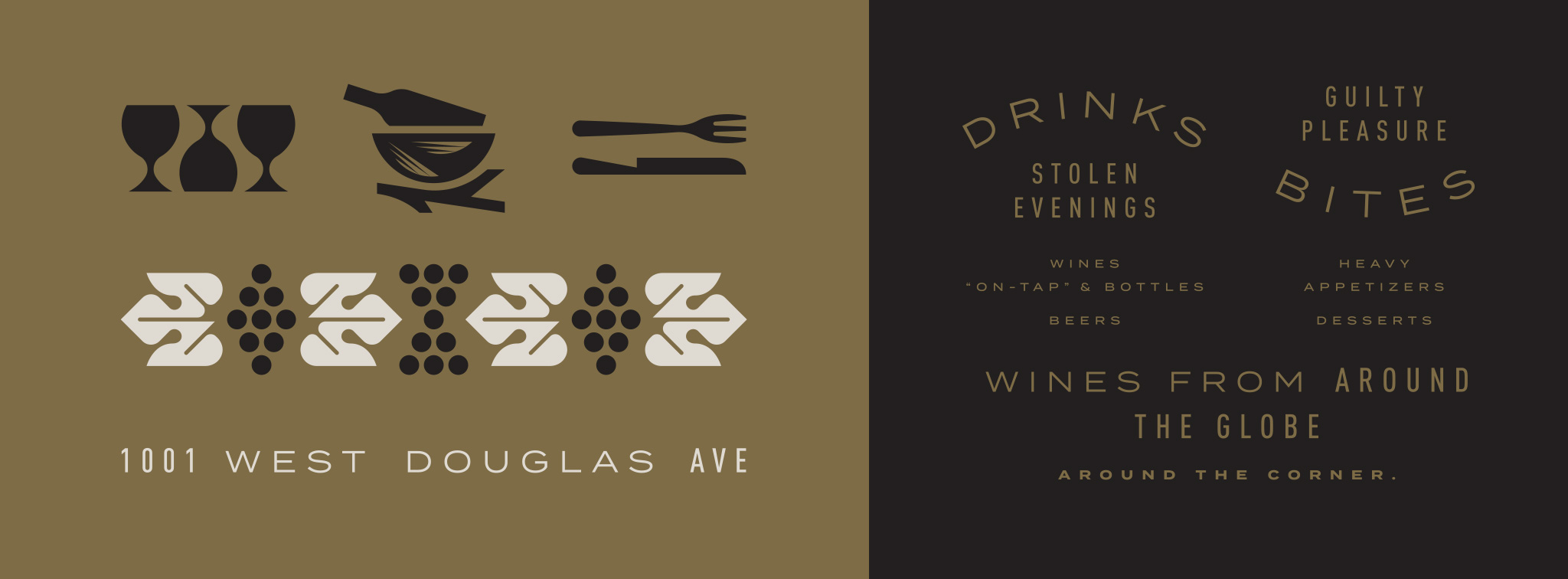
Then it was off to work developing the many different elements that go into the fuller brand language. Our team refined the ideas and stories until we achieved the upscale-yet-not-pretentious aura for the brand of Alzavino. Along with the logo, we honed in type selections, color palettes, and a whole suite of visual elements. All of these pieces work together to create a cohesive and recognizable brand.
Website
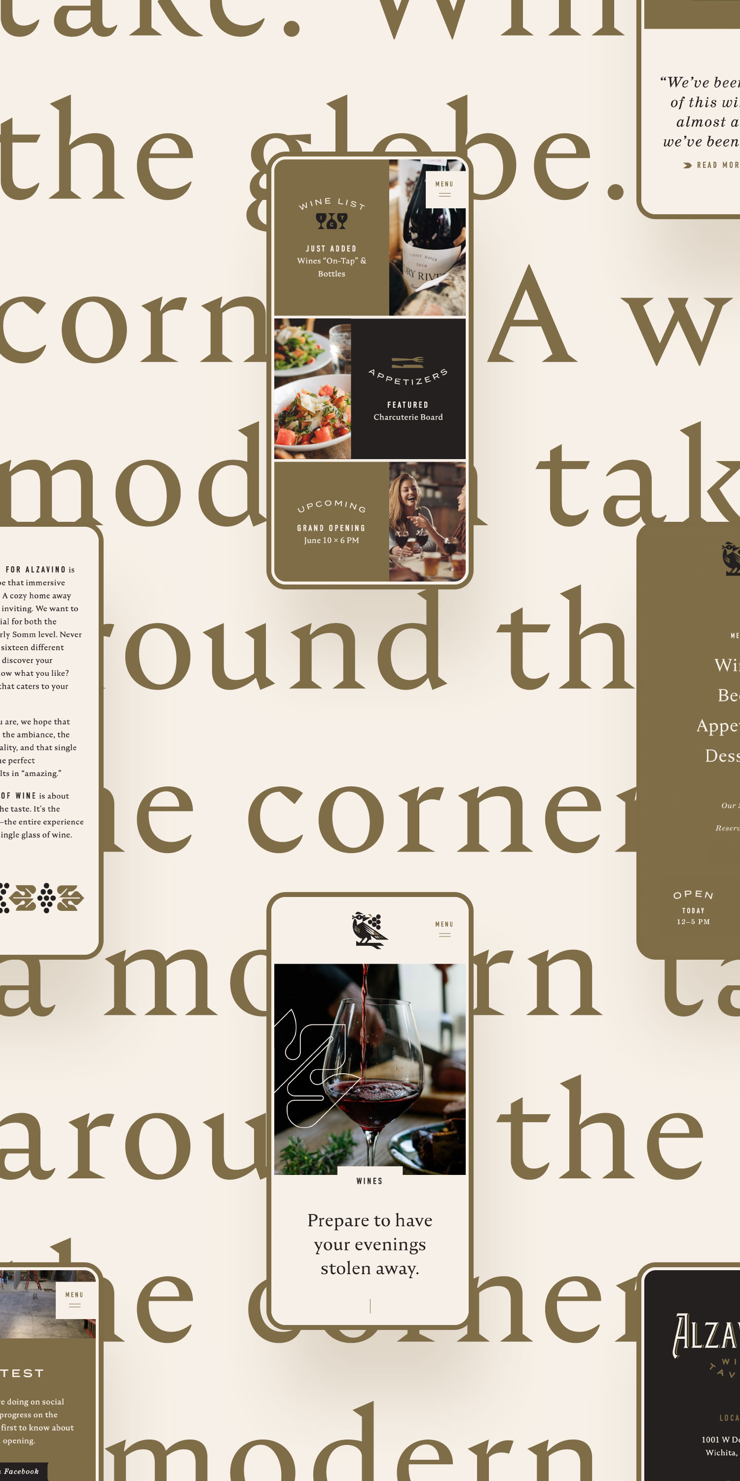
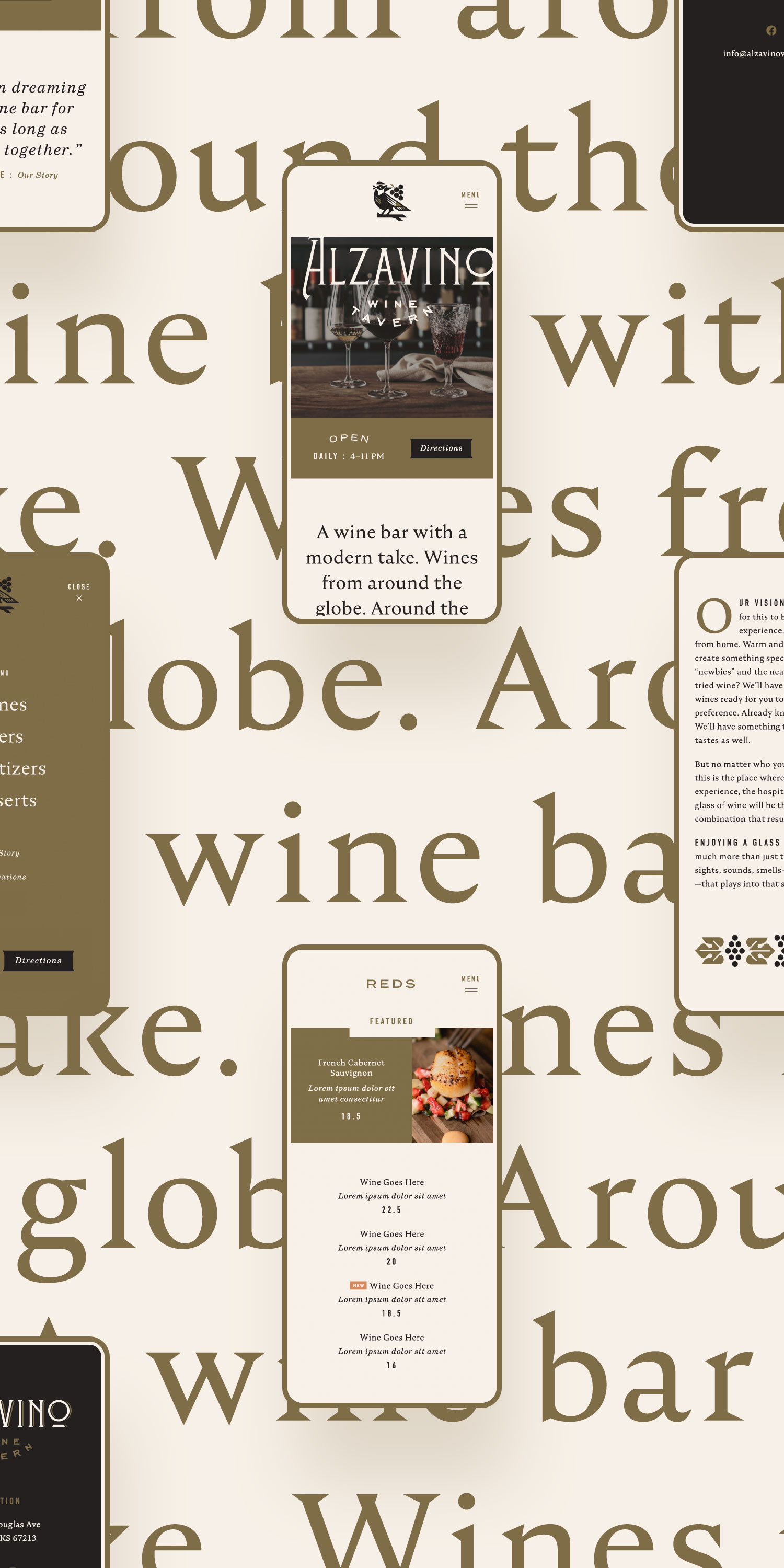
Once we had established the visual language, it was ready to be applied to everything, first of all the website. We built a lightweight, bespoke website to familiarize Alzavino’s new guests with the wine bar. The digital experience is meant to match the physical experience through authentic photography, consistent colors, and visual elements. Attention to details like subtle animations, page transitions, and mobile responsiveness make the difference for this website.
The Details
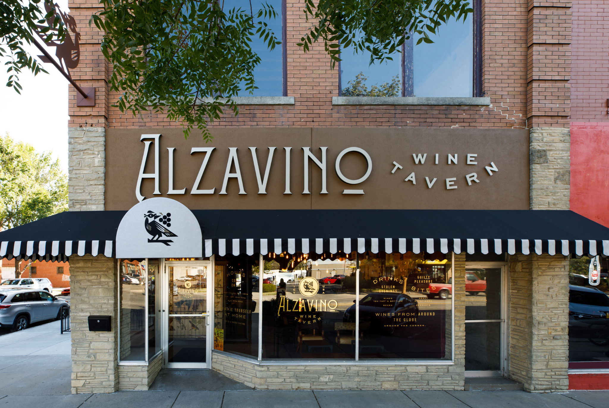
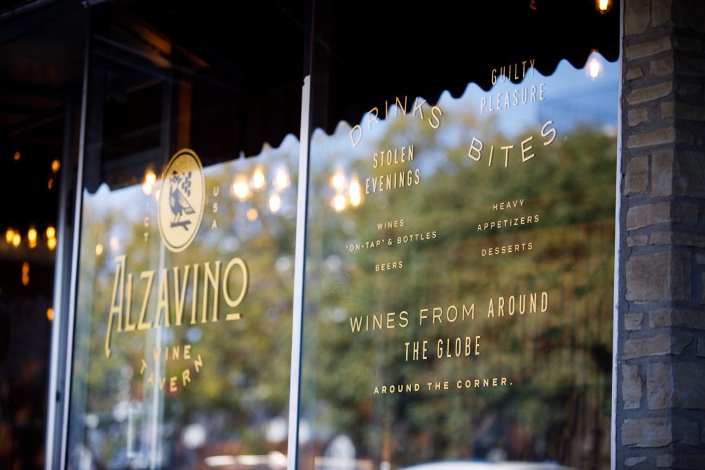
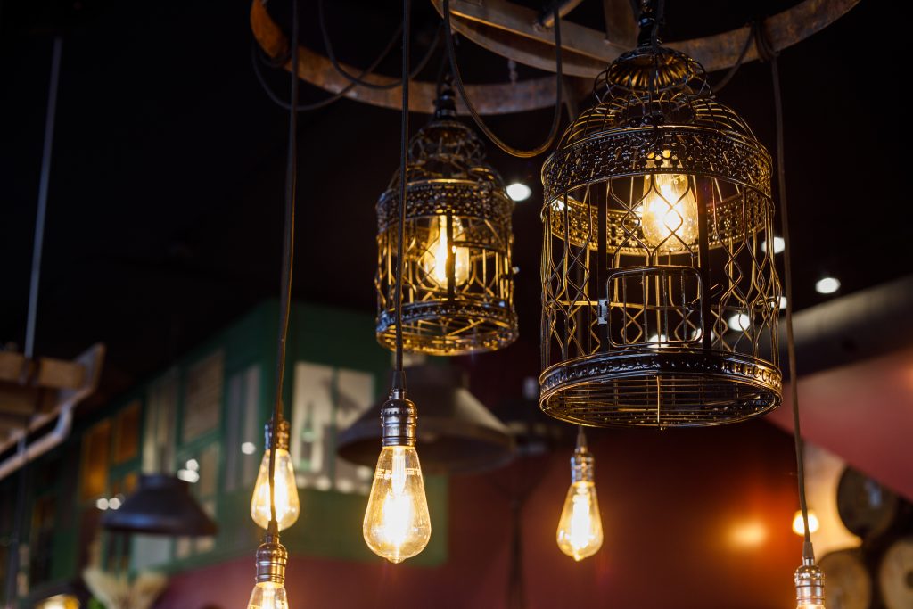
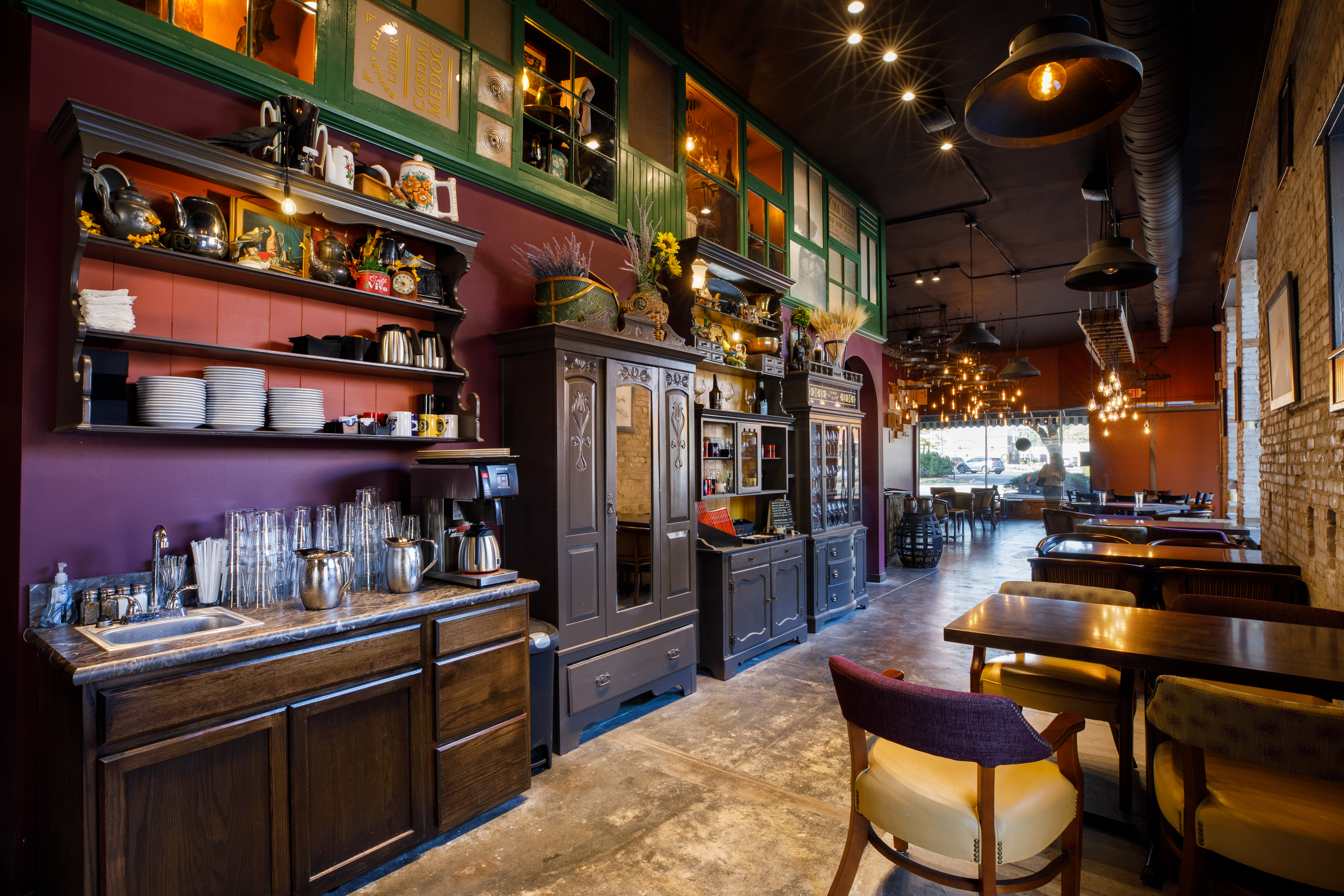
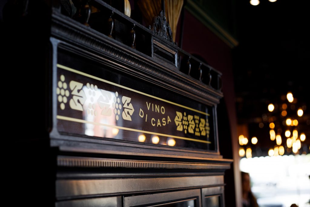
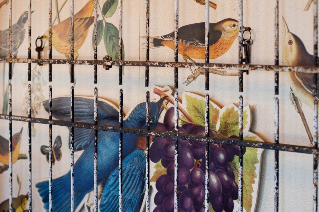
From both the inside and the streetside, the look of Alzavino transports its visitors somewhere else. Working closely with our interior design partner on the project, we helped envision and bring to life a dining ambience for Alzavino’s location in the Delano District. A cozy hole-in-the-wall venue filled with rich colors, flavors, and all the tiny details that make the difference.
The Results
Since their grand opening, Alzavino Wine Tavern has been the site of many a delightfully stolen evening for Wichitan wine enthusiasts. Their refined and playful atmosphere has created a locale where wine novices and experienced aficionados can partake in the guilty pleasure that a bottle of fine wine can bring.
For Ken and Danielle, their vision has become reality. “When we envisioned what this was going to look like, feel like, with the atmosphere, the clientele, and just every component of it, the result could not have matched up more perfectly.”
“A large reason for that successful culmination was Gardner Design setting us up from the get-go with the right logo and brand.”
Danielle Harmon, Co-Owner
