Need a creative partner
for your next big idea?
6 Meridian
Forging a new identity in wealth management

The Result
A meaningful independent identity that sets
the right impression from the start.
Background
When a group of wealth advisors and investment managers that manage more than $2 billion in assets from high-net-worth individuals struck out on their own, they came to us.
How can we serve our clients even better? That’s the question this team asks themselves every day. And the question their branding needed to reflect. Because their ultimate goal is to build strong relationships with clients, knowing their financial goals and helping them achieve them. So clients can hold onto their hard-earned wealth for years and years to come.
What We Did
After extensive brand discovery, we guided the team through the process of adopting a new name and visual identity. We knew this new entity made of an already established team needed to resonate with both intrigue and familiarity. A brand that would communicate their skill and experience. While also evoking the high levels of comfort and trust necessary to put your financial future in someone else’s hands.
- Nomenclature
- Identity
- Website
- Video
- Interior Signage
- Correspondence
- Brochures
- Ads
- Photography

Nomenclature
In 1855, the Sixth Principal Meridian was established as a launching point from which surveyors trekked across wide expanses of land to provide guidance to those in search of possibility and prosperity in the western regions of the United States. This meridian runs straight through the firm’s hometown – Wichita, Kansas – via Meridian Avenue. It’s a unique piece of history in the community.
During the nomenclature process, it became clear this was the perfect name. Why? The team employs an approach and practice similar to early pioneers – survey the landscape, calculate and assess nuances, report findings, and assist in the planning of futures.
Sophistication, approachability and competence – it’s everything a wealth management brand should be.


Visual Brand Presence
Trust is key when it comes to gaining and keeping wealth management relationships. The 6 Meridian team needed branding that would establish and build it. A simple yet powerful logo anchors the brand – a monoline (aka single-line-weight) design that combines name elements with the symbol of a prospector’s tool.
Adding to the look is professional-yet-approachable photography along with stable neutral tones and a pairing of classic serif and sans-serif fonts.


Website
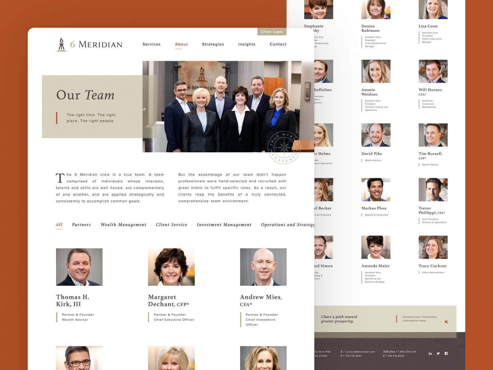
Clean aesthetic. Eloquent copy. Consistent voice. 6meridian.com elegantly unfurls the brand while describing philosophy and services. It provides access to information on their service approach, interactive fund sheets, a company blog, and news. Visitors get to know the team’s incredible professionals in a way that is friendly, casual, and not at all intimidating.

Office Décor
6 Meridian’s physical location carries the same rich brand aesthetic throughout. Wall colors, furniture, and rustic-yet-sophisticated wall art further illuminate the brand aesthetic. Continuing to build trust through consistency. And putting clients immediately at ease.


The Results
6 Meridian has seen continual growth, already maintaining and building the clientele base and reputation of a well-established firm. In fact, in 2018, they made Financial Advisor Magazine’s list of the top 50 fastest growing RIAs in the country.

