Why Fashion Brands All Seem to Be Using the Same Font
Are brands losing personality? Or is simplification part of the strategy? Rob Walker references Bill Gardner and others to shed light on this trend.
by | 20 Nov 2018
This post originally appeared on Bloomberg.
Perhaps a rose by any other name would smell just as sweet—but what if that name were written in Comic Sans?
Typographic logos are tricky things: They can communicate trust or chaos, make you look smart or clueless, and come across as expensive or cheap. If the name belongs to a company that stands for heritage and quality, getting this right is serious business.
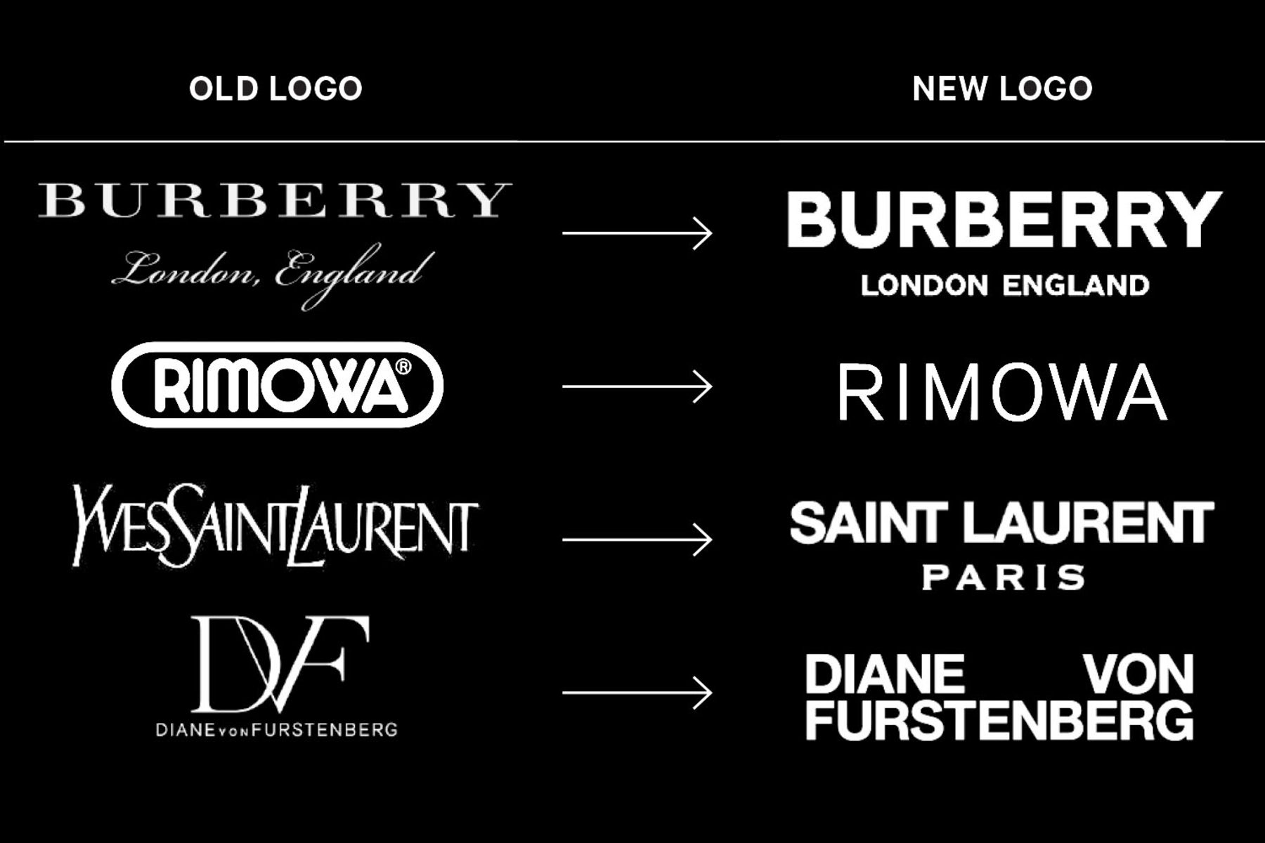
Shortly before London Fashion Week this fall, Burberry Group Plc unveiled a new version of its logo before the first runway collection under new Chief Creative Officer Riccardo Tisci. The old Burberry word mark hadn’t changed much since its “equestrian knight” was registered more than 100 years ago. It looked like something chiseled into the side of a venerable government building: slender and delicate letters, airily spaced with officious serifs.

The new logo has a heavier, bold look with a geometric sans-serif treatment. It’s louder, like a sticker on a skateboard—or one used to vandalize a venerable government building. It was created by graphic designer Peter Saville, famous for his Factory Records album covers in the 1980s and, more recently, for his work with Lacoste, Tate Modern, and Yohji Yamamoto.
Although he’s no stranger to high-end clients, Saville resists the idea that typefaces possess an intrinsic meaning or price tag. “‘Luxury typography’ is kind of a non-sequitur,” he says. Instead, he was guided by Tisci’s desire for the treatment to work just as well on a gabardine raincoat as on a chiffon blouse. He describes what he and Tisci settled on as “modern utility,” adding, “It looks like it’s been there forever, but it’s still contemporary.”
Many purveyors of upscale goods are choosing a similar feel. Bill Gardner, a designer who obsessively tracks corporate identities at LogoLounge, cites a litany of pricey brands that lately have opted for the all-caps sans-serif look: Céline, Rimowa, Diane von Furstenberg, Balenciaga, and Saint Laurent, as well as Saville’s own refresh of Calvin Klein in 2017. All have been transformed into crisp-angled letterforms. When the Burberry redesign made its debut, design blog Brand New gave it a snarky welcome: “It is no more different nor more or less interesting than any other fashion sans-serif logo.”
At first, these designs might seem interchangeable, but look harder and you’ll see differences. Some are heavier weights, while others have more space between the letters. That said, the overall trend is hard to miss: Luxury isn’t connoted with fussy extras; no-nonsense boldness is the rule. “Spartan solutions have been rampant in all areas of design,” Gardner says.
Armin Vit, co-founder of design firm UnderConsideration and its blog, Brand New, says the bare-bones look is “like wearing a black-tie tuxedo.” It’s not flashy but leaves room for personality to come through in other ways. In Burberry’s case, that includes a striking monogram print from Saville that the company has used aggressively in its rebranding efforts.
Sarah Hyndman, a London designer and author of Why Fonts Matter, has spent years playfully testing associations between typography and luxury. After asking hundreds of people in surveys to respond to fonts as “cheap,” “expensive,” or somewhere in between, she found that most consumers tend to view high-contrast fonts with thin hairlines, such as the old Burberry logo, as more high-end. Script treatments—such as the one that renders “London, England” beneath the word mark—might aim to suggest the sophistication of a Bordeaux wine label, but in a fashion context they come across as pretentious. To many, Hyndman says, this is simply “trying too hard.”
Gardner says the bold sans-serif look is nearing the end of its trend life. Yogurt brand Chobani recently unveiled a much-hailed redesign that relies on fat, almost childish curves, suggesting something closer to a circus poster than a granite facade. The Netflix hit Stranger Things has the same feel. In the past year, Coach parent Tapestry introduced a similarly bulbous, whimsical logo.
Ultimately, luxury isn’t about mimicking trends. It’s about a timeless and enduring form of value: current yet classic, expensive but worth it. The new Burberry logo isn’t very different from those of other fashion brands, but that’s also by design. After all, a tuxedo may communicate an image of refined taste, but not if you’re the only person at a party wearing one.
Bloomberg connects decision makers to a dynamic network of information, people and ideas. Bloomberg quickly and accurately delivers business and financial information, news and insight around the world.
Need a creative partner
for your next big idea?