Industry
2018 Logo Trends
Neo vintage. Hipster. Blurple? Bill Gardner breaks down the top logo trends happening in 2018.
by | 30 May 2018
Neo vintage. Hipster. Blurple? Bill Gardner breaks down the top logo trends happening in 2018.
by | 30 May 2018
This post originally appeared on LogoLounge.
This year’s logo trends were influenced by a pendulum shift that’s starting to swing from clean, modern aesthetics toward curvy, retro designs that reflect a new attitude through color and embellishments.
Any time we look at trends, we tend to see that there is a pendulum that is swinging. For instance, it’s not uncommon to see an evolution from a flat logo to something dimensional or vice versa. But over the last three years in particular, from a typography standpoint, we’ve seen a transition toward very austere sans serif logos. Google flipped from a serif font to a sans serif, and other major brands like Verizon, Calvin Klein, and Century 21 did the same.
Part of what’s going on here is this idea of clarifying the message and conveying transparency. Unfortunately, it also strips these brands of any personality when it becomes too sterile. However, this year, the pendulum is starting to swing in the other direction as a direct reaction.
When everyone moves to this level of simplicity, designers counter it with some embellishment. Very expressive logos are making a comeback, which is a direct result of nostalgia or reboots. We’ve seen it played out on the big screen in Ready Player One and on the small screen in Stranger Things. There’s a thirst for nostalgia and this hearkening to past decades. Designers are dusting off their old font folders, going back to designs that were popular in the ’70s, ’80s, and early ’90s. Letters with big, expressive serifs, similar to a man having a mustache-it’s an added embellishment that changes the viewer’s perspective, perhaps recalling a different time period, but done in a uniquely new way, with modern influences. Millennials are most responsible for bringing these trends back into play, and you see it everywhere with the resurgence of tiki bars and speakeasys, and custom products like shaving kits for men. By going backwards, you can pick and choose what you want to bring forward and blend it with contemporary aesthetics. I’ve seen a lot of brands doing this successfully, and I think it’s just the beginning.
Color expectations have also changed dramatically. Because color mostly lives onscreen, there is a greater intensity in color range because it’s being projected from a screen. Colors are merging and blending, and gradients are now part of our color dialogue. A lot of this has to do with apps like Instagram—which, in fact, has a gradation as part of its logo. That’s an extreme example, because it runs the gamut from yellow to pink to purple, but most gradients are very subtle like red shifting toward red-orange, in essence making a new color. People now recognize gradients as colors. This is a trend that will continue to shift and grow.
All three of these movements work together as nostalgia swings the pendulum through different decades and influences color choice and customization. You’ll see a vast array of these examples throughout the report.
It’s important to note that trend is not a bad word, and it doesn’t equate to trendy, as in here today, gone tomorrow. The logos featured here are on the outer-edge, influencing the next big thing. Much of it is experimental, which ultimately pushes design to the next evolution. We all live by trends—whether it’s fashion, food, or design. We like them and we adopt them because they make life more diverse and fun, even as they evolve and change. The key takeaway from this is not to imitate, but to find a way to push these ideas forward and make them your own.
Much as a tide and time can dull the sharpest corner of stone or random shard of glass, designers are tossing the occasional mark into the wash for one last tumble before presenting to clients. This is a bit like over-easing the edges before handing off a newly minted bobble to a child. Guaranteed, there will be no eyes poked out in the handling of these logos. The key phrase here is not easing, it’s over-easing. There is a certain level of finish that occurs when knocking back a sharp corner, but in over-amplifying the effect, designers are delivering an entirely different message.
A friendlier, more approachable mark is crafted, but by applying this effect, the designer assures the consumer a certain level of implied simplicity. The mark represents a process, product, or service that’s been tested and worn in to remove any unfriendly burrs. Simplicity of initial design is imperative as a starting point, and you may notice most of these are a single-color solution. Reduction of tumbled logos never create screen challenges as a computer’s process of simplifying detail has already handled it. As friendly as these are to consumers, clients should have reasoning in mind when asked, “Why so round?” How much you should ease a corner can be like the fine line between a healthy tan and someone who’s over-baked on the tanning bed.
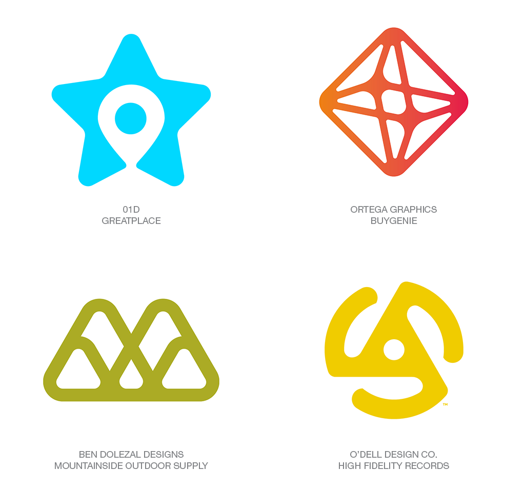
One of the tenets of logo design is that forward motion means up and to the right. It’s the direction you want your investments, or your production to take if you’re looking at a graph. It’s the difference between gazing up to the future or glancing back at the past. So, what a surprise to discover a flurry of up and to the right parallelograms littered throughout this year’s field of work. And though the symbolism is not unexpected, the sheer number of them is. And the puzzlement of this discovery is only matched by the diversity of applications.
The nature of the oblique shape gives it a sharp, aggressive attitude. An element captured in motion and perfect in form to serve as a vehicle for type or as a passenger to accent a larger message. Note the parallelogram in the lead role with Carling or as a demure accent on the “i” in Stripe. Or taking on a number of configurations to speed other solutions to the fore. A remnant of Spartan attitude remains in this trend that leaves no home for embellishment. All of these are clean, to the point solutions that signal “up and to the right” as their clients’ mantra.
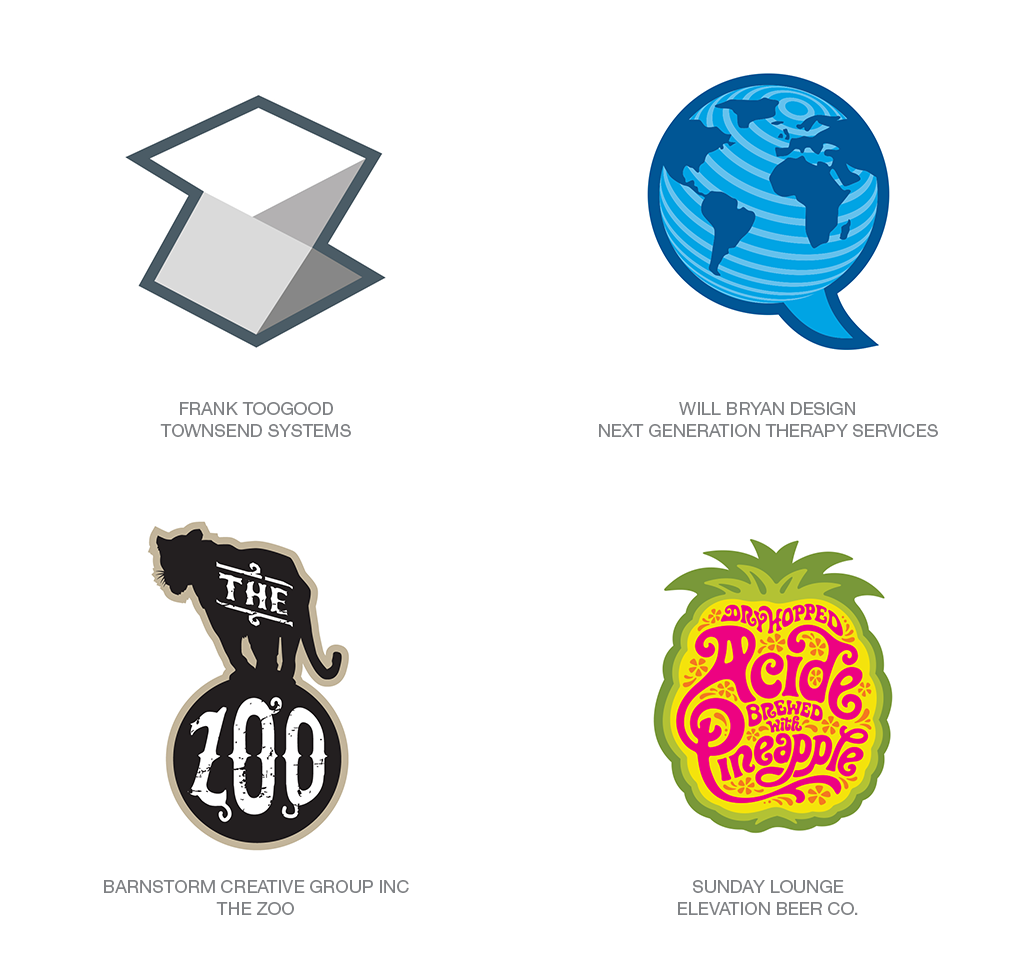
It’s easy to muse that master sports logo designers may lose credentials and peer respect if they ever released a mark without encasing it in a wide gray outline. How else would we know it was for a team? This may or may not be the influence at work, but over the last year, we’ve seen an uptick of logos with absolutely no sports affiliation tightly ensconced in their own mono-weight outline. An astral aura if you will, exuding a rich karmic energy.
Drawing attention with a highlight outline in most of these cases adds a nice touch or serves a functional purpose, but you have to ask to what end. It may imply a team essence to the entity or much as sports logos, it may be designed to allow the image to work on both light and dark color fields. Note that the Acid Pineapple actually has a double aura. A better hunch is it’s a stylistic pop of embellishment that allows an otherwise unremarkable mark to capture additional attention and project a bit of its own graphic energy.
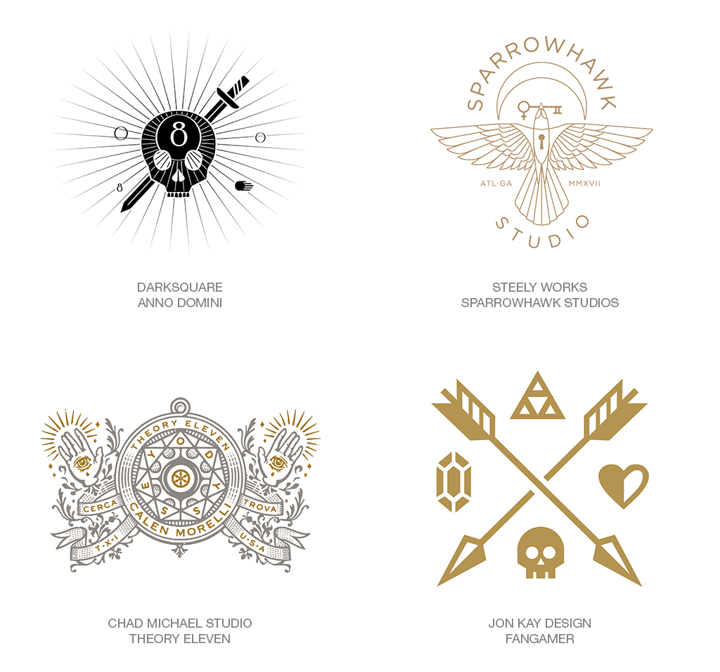
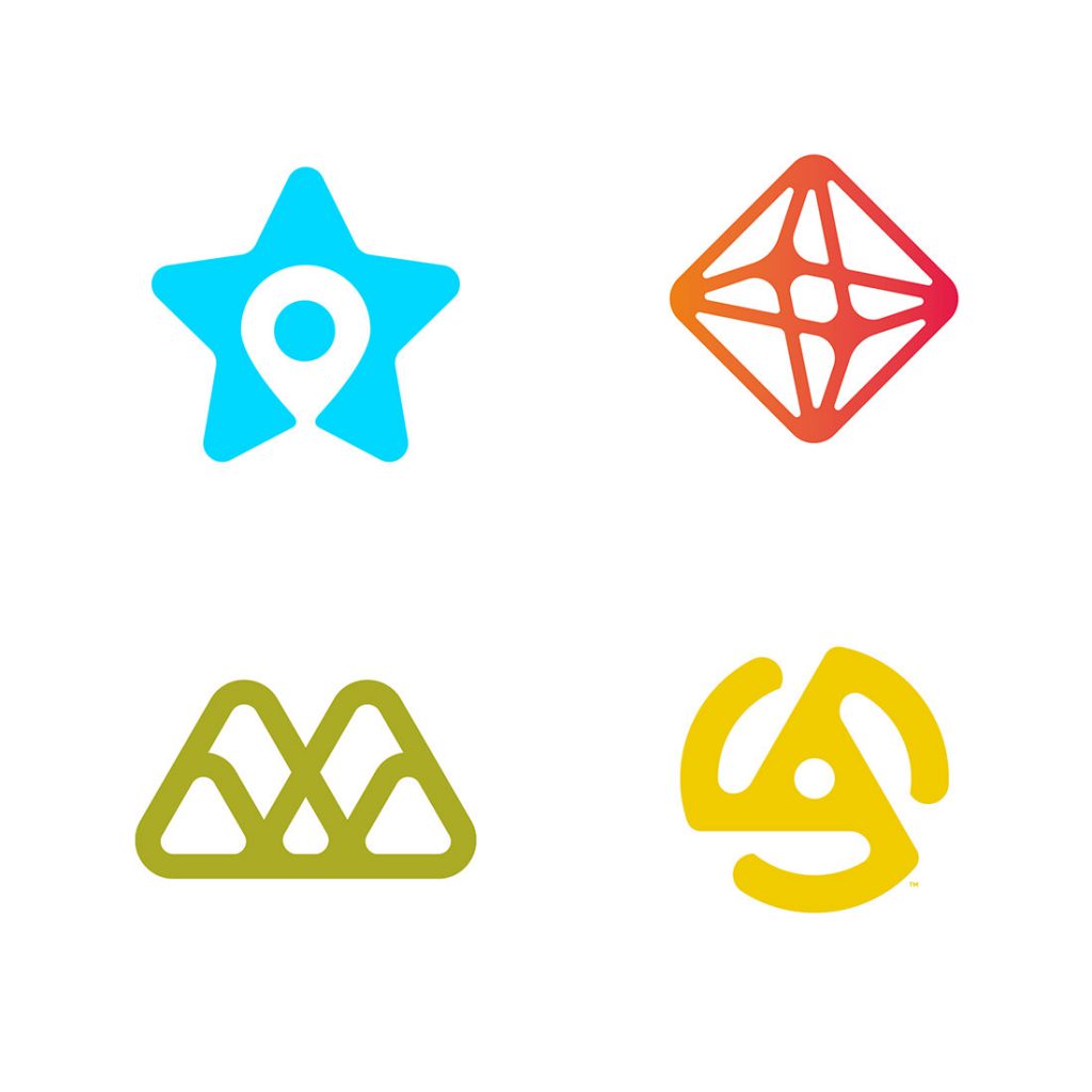
Let’s start by recognizing the works in this trend are not going to be seen representing anything more than a designer’s folio site. They might appear on a couple of great T-shirts or a band’s drum kit as well, but more than anything, these logos tend to reinforce the design fraternity’s infatuation with rich symbolism. These stars, jewels, hearts, arrows, and skulls are so entrenched in the lore of secret societies that their very essence reeks of mystic ritual. Either that or naivety blinds us to an underground designer cult with secret passcodes and a handshake.
From a design standpoint, these explorations are beautiful to view and demonstrate how a crafty designer can build an aesthetic fortress from completely vacuous elements. Exercising our design chops on fantasy projects is not completely bereft of value, though. This group has elegance of execution and each could, for example, represent another topic altogether after exchanging a moon, a hand, and a sword for a couple of roosters, a pig, and a chef’s hat.
In a common thread, designers are retreating this year to a number of themes drawn from past influence. Which is not too dissimilar from the movies only generating sequels and remakes. There’s certainly a level of guilty pleasure involved in turning back the nostalgia dial, but such efforts seldom create advances in our craft. Whether born as an antidote to put the brakes on a fast-paced counter movement or to fill the time while we give serious thought to where we go from here. We must also consider these forays into the past as a revisit for an older generation, but as a first-time trip to the more recently minted designers.
Imagery that was plucked from the last century seems to be fair game here. A wink to Mid-Century Modern is still popular, as is the reboot of ad mascots and characters of the same era. Note that many of these examples blend a typographic solution with a primary image, much as other badges we are looking at in this report. A noticeable marking tag for this group may be the placement of a primary typographic solution or wordmark plopped dead center on top of the supporting image. Fun, light-hearted, and well-crafted but with the gravitas of a romance novel.
Read the rest of the report at LogoLounge.com.
LogoLounge.com is the world’s largest logo search engine. Nearly 300,000 logos have been submitted to the site since 2002, growing it to the largest online treasury of professionally designed logos. Through their submissions, members also gain the benefit of consideration for publication in the LogoLounge book series, the best selling graphic design books series in the world.
Need a creative partner
for your next big idea?