LogoLounge drops its 2022 Logo Trend Report
More than just a space to catalog logos, each year, LogoLounge is known to create a trend report highlighting the most seen trends of the year and what we can expect to see moving forward.
by | 20 Jun 2022
This post originally appeared on Dieline.
It’s fascinating—and a little scary—to think about how much information the internet is home to. For years and years, it’s been hosting facts, statistics, home videos, personal anecdotes, cute animal memes, archiving fonts, and historical references. The list is seemingly endless.
Overwhelming? Sure. But, it’s also exciting to think about how accessible knowledge is, especially in the design world. Celebrating its 21st year of hosting a searchable database of logos, LogoLounge is home to well over 350,000 logos submitted by its members, further proving the extraordinary capacity of the internet and a testament to those little emblems sparking such great debate—and, yes, vitriol.
“I’ve been at this for two decades, and it never gets old. Every year it’s fascinating, and more and more, I realize just how important it is.”
Bill Gardner, President, Gardner Design; founder, LogoLounge
More than just a space to catalog logos, each year, LogoLounge is known to create a trend report highlighting the most seen trends of the year and what we can expect to see moving forward. “We’ve never had so much information readily available at our fingertips online and yet so little context,” Gardner added. “No idea comes out of thin air, and the Trend Report allows us to see not only which way the wind is blowing, but why it’s blowing that way.”
This year, specifically, the report helps create a digestible framework for these artful designs. And, in a world drowning in content, it’s helpful to break things down to their most basic level so we, as humans and designers, can be fully aware of a logo’s impact across all types of design, packaging included. Being exposed to so much daily is exhilarating, but it can easily lead to a cluttered mindset or one that no longer processes the extent of the designs we see.
“Only when you grasp the trends can you transcend. For the 2022 report, we saw much consideration of wordmarks and typography playing a more important role—all recognizing the need to build some ownership of visual memorability into an otherwise anonymous solution,” said Gardner.
“Reverse contrast (or reverse stress) catches people off guard, and looping letters and flat elongations of horizontals in traditional letter forms are also trying to force a unique foothold into bland brand sans serif wordmarks. Excessive ink traps in sans serif and serif fonts also shook things up, as well as heavy condensing of fonts–some very tall.”
Below you’ll find a few of the trends highlighted in the report that have seamlessly crossed over to the packaging design world. And if you feel inspired to learn more about the trends in packaging design specifically, be sure to check out Dieline’s 2022 Trend Report.
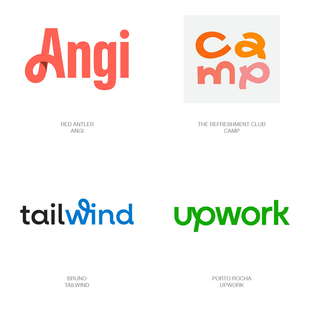
Loopers is an about-face from the “blanding” of all things in recent years. In a world where many organizations leaned into a more minimalistic feel, these brands infused their logos with sans-serif typefaces that were still gorgeous and included splashes of whimsy. A brand that beautifully highlights the balance of simple eccentricity is the macaroni and cheese brand Camp designed by The Refreshment Club. The “Loopers” logo takes over the packaging design, becoming the primary focus in addition to the vibrant colors. Without the memorable logo for this packaging system, you’d be left with a colorful box.
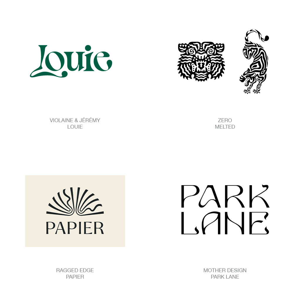
Like all significant design trends, they often fade away and come roaring back. The Art Nouveau movement is back and better than ever, and we’ve seen the effects throughout the entire design industry. According to the LogoLounge report, “Intoxicating letter forms, cartouches, and illustration best signaled the graphic aesthetics of this movement in round one.” We saw this logo trend translate into packaging design within multiple industries, most notably the beauty and beverage markets.
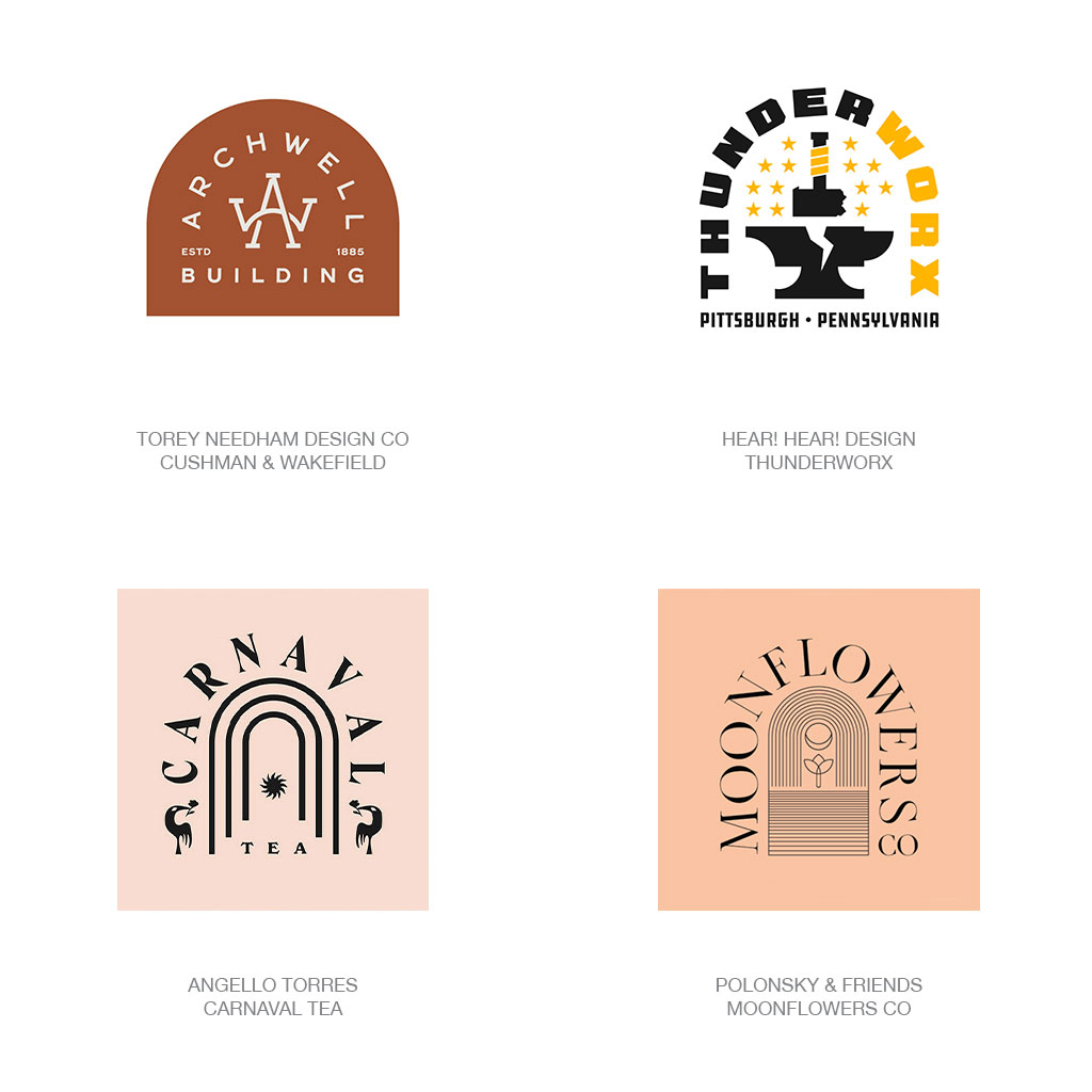
You expect to see a logo on a straight horizontal plane, but if you give the typography a dramatic arch, things get shaken up. LogoLounge noticed the trend of logos taking an unexpected turn—literally—surrounding a brand’s symbol. Not only does the arch create a sort of portal to an illustration, but it adds a particular contemporary framework to an approachable design. We saw this style pop up in the packaging world, most notably in craft brewers and more down-to-earth brands like Bamboo Granola, designed by Shawn Scott Studio. Because there’s a more hand-made feeling to the Over Arching trend, it makes sense that brands that feel less stuffy would take a shine to this style.
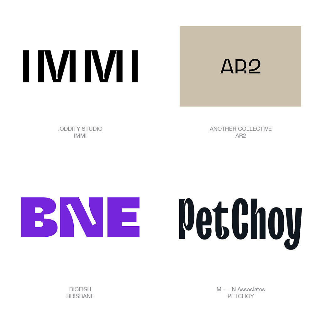
In typography, the negative space in individual letters is known as an ink trap. LogoLounge identified that ink traps are a hot commodity right now, and designers are using them to create exciting shapes and unexpected moments. Dubbed as “Super Traps,” we’ve also seen it translate into the packaging design world. Pet Choy, for example, is a dog food brand that implemented these Super Traps into its logo and packaging text, even placing dog and cat cutouts into the letters. In tandem with the playful color palette, the unexpected details in the typography create a whimsical approach, beautifully separating this pet food brand from the rest.
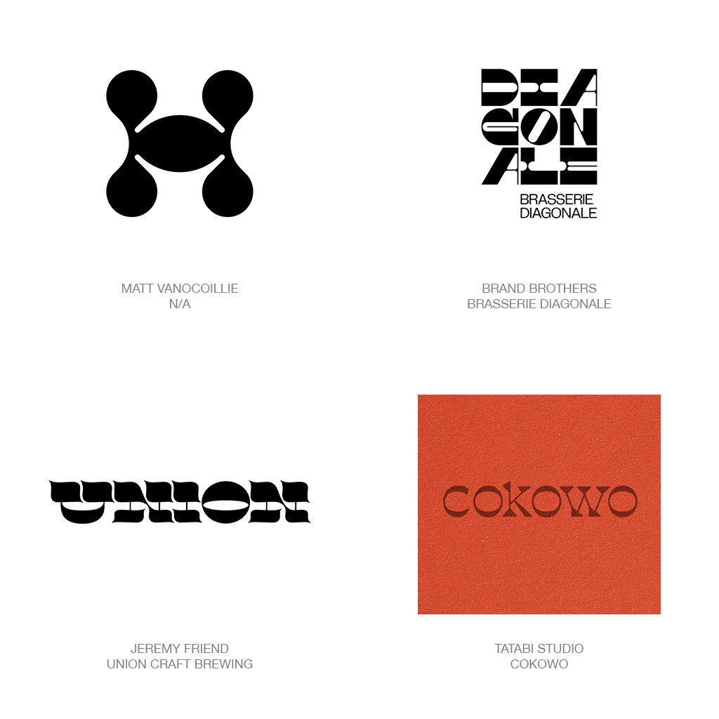
A craftsman at William Caslon’s type foundry designed a typeface to mock other typefaces with thick vertical lines and fragile horizontal ones. But instead of a parody, the design style took off, creating a typeface full of character that turns up the fun when used for editorial. But it’s also fascinating to see these highly vivacious type styles wiggle their way into logos, even for packaging. Most notably, we saw this style with RuPaul’s House of Love canned cocktails and mocktails.
It’s noted in LogoLounge’s report that “trends are just trends,” meaning that just because a style is prevalent to some doesn’t mean that you have to like it. Understanding what’s happening in the design world is essential, whether or not you agree with it, because it gives you a sense of what your average consumers see daily, creating a repertoire of what’s working, what’s not working, and how to continue to evolve designs stylistically.
Need a creative partner
for your next big idea?