Industry
The results are in: LogoLounge’s 2021 Logo Trend Report
One of the most challenging parts of developing a new brand, beyond figuring out the ins and outs of the actual business, is designing a logo.
by | 07 Jul 2021
One of the most challenging parts of developing a new brand, beyond figuring out the ins and outs of the actual business, is designing a logo.
by | 07 Jul 2021
This post originally appeared on PRINT Magazine.
One of the most challenging parts of developing a new brand, beyond figuring out the ins and outs of the actual business, is designing a logo.
Seemingly, it’s just a tiny part of the brand, a minor visual identifier that consumers may or may not remember. But, in all actuality, it can make or break a brand. It’s small, but it’s mighty, and it can speak for your brand without saying a word. Logos are an essential key to any brand, just think about your favorite products, and I guarantee you can visualize the logo.
Logo Lounge recently released their 2021 Logo Trend Report, and it’s a phenomenal resource for discovering not only will be seen in future logo designs but the styles that will also be seen in graphic design in general. Because this is their 18th trend report, and this year alone, they sifted through 35,000 logo submissions, you could say that trend forecasting is their forte.
According to the report, this year is all about the drama.
Bill Gardner, the reporter behind the forecast stated, “preparing for this year’s Logo Lounge Trend Report, I couldn’t help but land on the word drama. No, not the flippant kind that plays out as passive-aggressive jabs between partners, but more like the ancient Greek kind: comedies, tragedies and satire that help us fully connect with the human experience.”
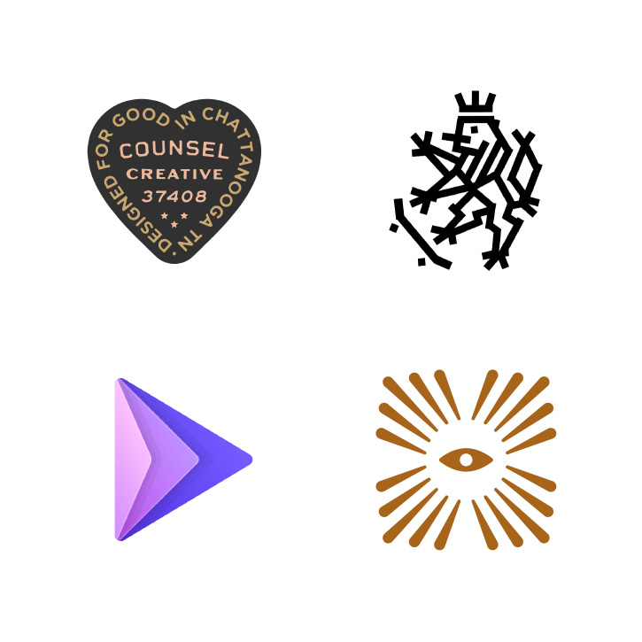
Sitting at number one, the asterisk will be a design feature of the future. The little star can already be found in logos of big names such as Walmart and FedEx, but looking forward, you might find iterations more flexible and creative.
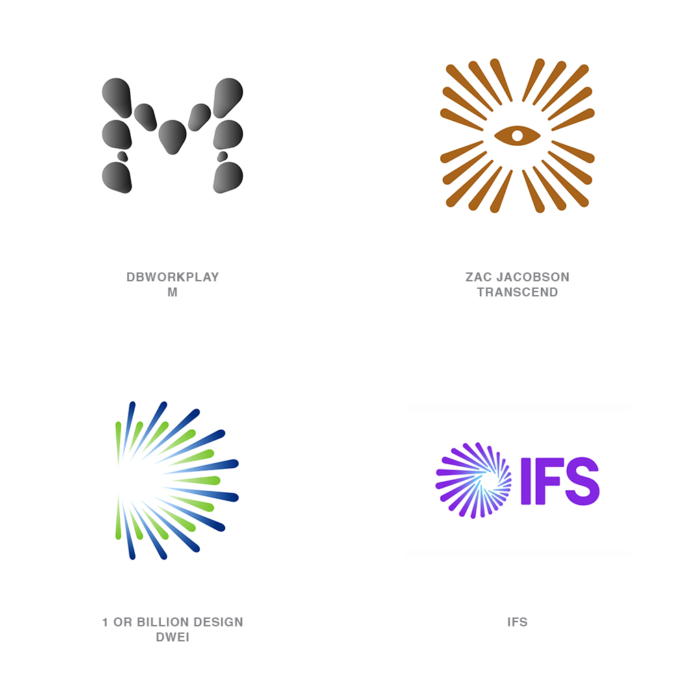
Another logo style that you might see more of is the electric tape-inspired design. Think DIY meats street style meets niche markets meets mainstream? It’s eclectic, and that’s why it’ll appeal to the masses. According to the report, the flexibility allows it to combine illustration and typography effectively, and the absence of curvatures makes it both appealing and exciting.
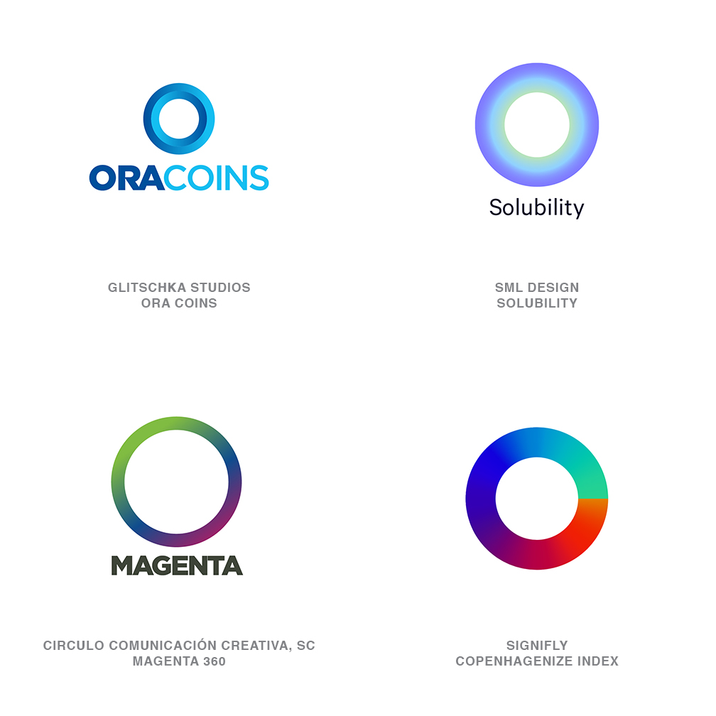
In opposition to no curves, however, the Merger trend takes inspiration from a droplet moving from one place to the next, sometimes in an orderly fashion, but sometimes not at all. The Merger trend demonstrates the ease of blending, a sense of flexibility, and charming imagination.
Unexpectedly, “Quads” is a fad that’s both unexpected and extremely neat and compact—utilizing four quadrants to make one succinct logo form that’s fitting for creative and dynamic organizations such as builders, museums, or urban entities. The quads trend can utilize vast geometric shapes and colors to create a compelling logo setup.
Other trends you might find in the future include Stacked logos, “Off Jog,” also known as a ribbon that changes course and then returns, or even logos that feature half-circles inspired by the geometrical aesthetics of chains.
There’s no limit to the creativity within each category of trend forecast, and although they might be titled “trends,” they are anything but trendy and could stick around for quite some time. It’ll be interesting to see what logos develop throughout the year and see how they may fall within each category. I’m also eager to see if any rebrands take an outdated logo and follow suit with the forecast. Only time will tell.
Need a creative partner
for your next big idea?