Industry
The Top Logo Trends of 2019
I’ve been studying logos for decades. Here’s what changed this year.
by | 11 Jun 2019
I’ve been studying logos for decades. Here’s what changed this year.
by | 11 Jun 2019
This post originally appeared on Fast Company.
Another year older, but the logo design industry shows no signs of old age. Like an unruly kid ripping through a stack of unopened presents, I eagerly dive into my annual logo report knowing an experience awaits. Sometimes it’s the gratification of what I’d hoped for, and the delightful surprise of unanticipated genius. Occasionally, it’s more analogous to underwear and socks, and I encounter the mundane or, rarely, the disappointing. Nevertheless, it’s evidence of industry vitality, and it’s all a gift.
So, first the good. This year’s trends continue to show curious and hardworking design prowess at work, moving us forward to greater heights. You’ll see in this year’s themes the continuation of themes past, with their own unique slant.
Meanwhile, modern culture continues to shift the ways we interpret symbols and how we visually prioritize in context, setting topsy-turvy the relationship between identity and application. Greater credence has been given the attending visual vocabulary as texture, pattern, typography, photography, and illustrative elements have shifted seats in the visual brand hierarchy. It’s becoming more common to see a brand driven by the supporting visual aesthetics, occasionally leaving the logo to call shotgun if it’s invited along for the ride at all.
Of course every yin has its yang, which poked up its head in the form of idea repetition, especially as new plugins, filters, effects, and animation tools are taken for a test drive. There are a few too many animated orbiting rings of type, as an example. Each is beautifully crafted and well thought through, but relying on the same foundational effect as a half dozen others makes it hard to build separation. It’s never wrongdoing to try new things, but the hope is that we still work with technology advances in our own unique ways to truly make our own mark.
As always, I’m grateful to the LogoLounge community of more than 20,000 designers across the world who provide much of the fodder for these reports. At the time of this report, our site stands at more than 300,000 logos strong, allowing our members and us to continue to watch trends as they develop in real time. It’s a privilege to work by their side to prop up the craft that we love.
Throwing shade on a designer’s work is as toothless as a heckler to a seasoned comedian. Show five logos and one gets picked. At best we have an 80% rejection rate. No doubt the seeds that make us so resilient and inventive. Tiring of the expected, this year our lot has crafted a new way to throw shade on their own work. That desire to eschew another field of gradient color for tone or a barrage of diminishing strokes to signal motion has given way to a concentric string of hyper-effective dots and dashes. Welcome a pleasant new way to break the visual tension of traditional shading while providing a pure vector solution.
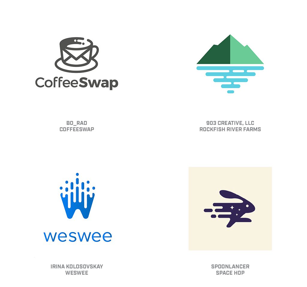
Over the last several years, we’ve seen dots and dashes with rounded extremities mingling together to demonstrate the melding of diverse elements. Usually running concentric or parallel to each other and not merging or emerging from a solid field. By extruding these out of a field or bridging these elements together and extending them out of an object, designers are presenting the consumer with the dot-dot-dot invitation they need to complete the picture in their own mind. A couple of dots in the CoffeeSwap cup and I get it. So you drop out the tail end of the speedy rabbit. ‘Nuff said.
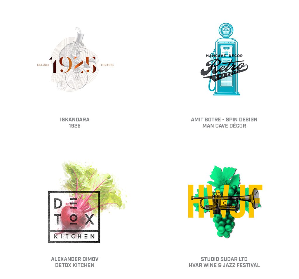
If you’ve met the person that groans when food on their plate touches, you’ve met the individual that will wince at these marks. Not only have designers removed any pretense of separation of elements, they’ve flaunted this layering of graphic components and even doubled down here and there to cloudy results. The majority of these deliver an engaging message that avoids overload and cleverly invites scrutiny. The formula for most is to build a top high-contrast layer with clear information and load it on a subordinate graphic that completes the story.
Two layers is good. Three layers is manageable. Four layers is a complete wreck. If the background is not decipherable, the dominant top layer of information will still function. These are generally akin to badges with a mixture of illustration and typography, but less separated by a hierarchy of scale and more by contrast. As these examples indicate, the aesthetic can range from vintage nostalgia to farm fresh–based on what you’re looking to dish up.
An enthusiastic generation of designers are reinventing the wheel, but with a whole new vengeance. In pre-digital years, any desire to lay stripes, dots, mezzotints, woodgrain, or other exotic half-tones into an illustration first required a trip to your local commercial arts supply store. Sticky backed sheets of film under the names Zipatone or Letratone came in an endless array of effects that could be had for a paltry sum for application to your art. No surprise that vintage design books are rife with logos displaying some pretty spiffy gradients leaving designers curious about this alien technology.
Marks shown in this trend are retro, channeling the 1970s not only in style but in adoption of tonal technique. Forget dropping in a 40% tint of black or your selected color from your swatch tab. The use of an over-scaled tonal effect is what rings true to the era. To a consumer, this only harkens back to a less demanding time subconsciously; however, it’s an effect that designers hone in on immediately–perhaps as a bit janky, but definitely a product of the way-back machine. An A+ for nostalgia but still a challenge if plans call for the mark to be scaled down. Too tight of a screen eliminates the charm, and at that point it might as well be gray.
It’s easily argued there are no new tricks in the field of calling attention to ourselves. Apes beat their chest, peacocks spread their plumage, and humans post to social media. Then there’s a small subset of identity designers that reach for a highlighter and start embellishing their work. Or at least that’s what this year’s Highlight trend appears to do. Otherwise proper and workman-like marks are made remarkable with a modest stroke or two to lay in the essential patch of vivid yellow.
We’re left with a bit of a feeling that these often black-and-white marks were presented to clients that were 90% on board before they reached into their top drawer, pulled out a highlighter to dab at the art and then expressed elation at their own addition. Areas of highlight range from indiscriminate to purposeful information, and in all fairness, these are out there in other popular highlighter shades like lavender, day glow pink, and electric blue. All fun aside, many of these are well crafted, and praise is due to the designers that recognized the spark of color was what lifts these marks out of potential banality.
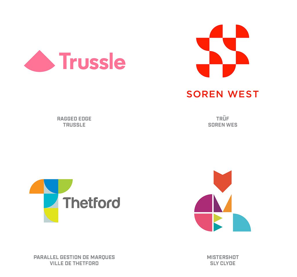
A continuation of theme from the last two years has been the move to simplification of design or purity of mark. This homage to clarity of structure and image from prior generations is proof of designers’ inventive nature as they noodle out solutions, rearranging the same geometric parts and pieces that have been in play since Euclid was a tot. Whenever you hear someone express the belief that everything’s been done before, just remind them that writers and musicians have been rearranging a handful of notes or letters and rendering new music and books for longer than logos have existed. Our well is nowhere near dry.
This year, the plethora of circles quartered and strewn about in a deliberate fashion can be found everywhere. Most often, these are the sole building blocks, but they’re also found mixed with circles, half circles, squares, triangles, and the other step-sibling array of geometric shapes. Purity of form continues to deliver a signal of simplicity or competence, even when representing a complex message. There continues to be a limit to the number of elements you can fit into a mark before it seems cumbersome. The Soren West mark is certainly an engaging solution, but is a half-step away from the quarter circle capacity.
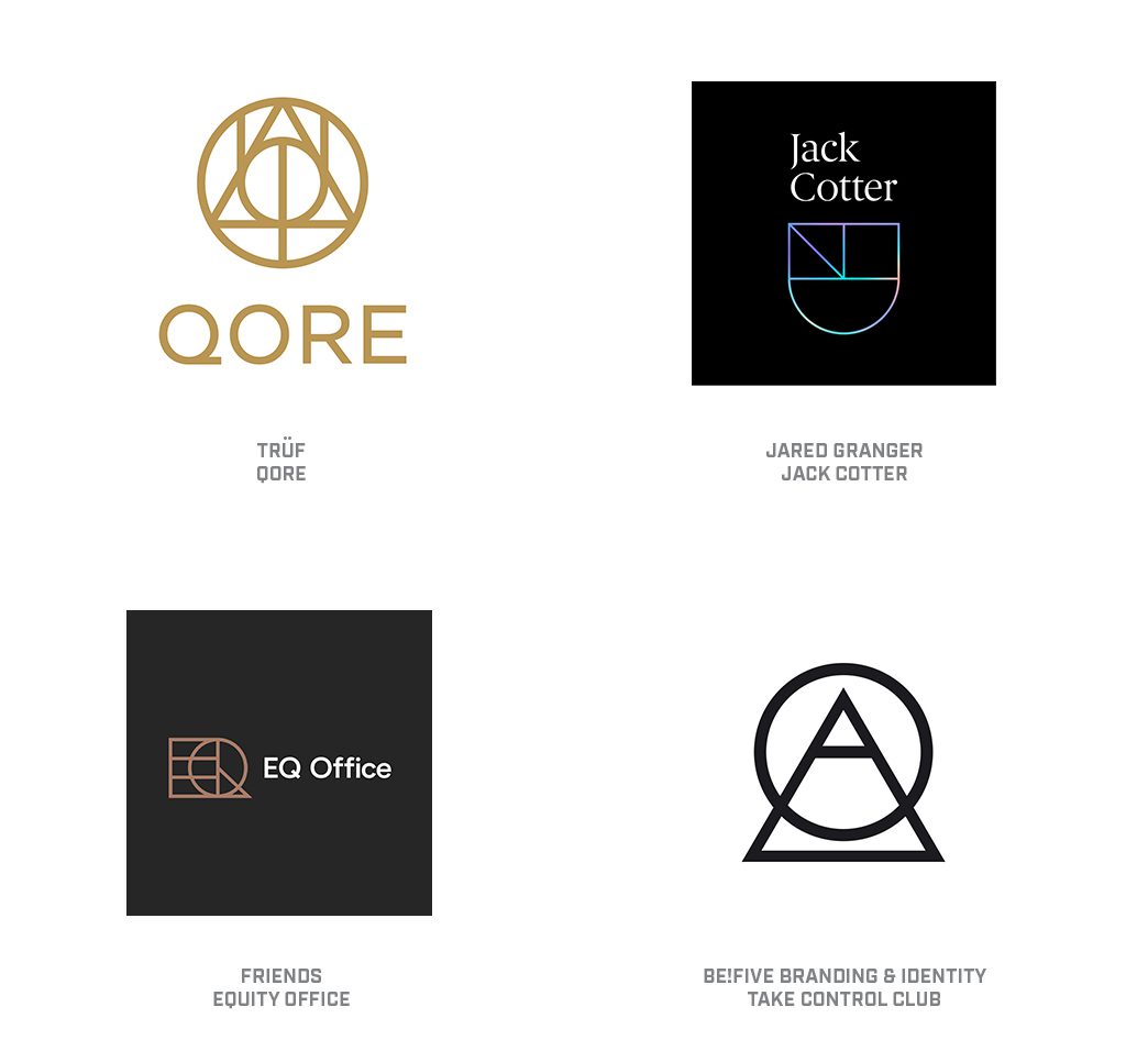
I’ll confess, the first impression of these marks left me wondering if a few designers have a crush on JK Rowling. The stone, the wand, and the cloak, incarnate from the Deathly Hallows. If these logo talismans have nearly as strong a tale to tell, they will serve their masters impeccably. One simply cannot look at these without believing every resolute stroke is placed in perfect harmony to the others and likely imbued with powerful meaning. I’m left feeling smarter for just having seen these.
The clarity of the earnest strokes, the perfected angles and immaculately radiused curves intersect like precision crosshairs . These instill a technical superiority to their owners and leave us with a sense of competent infallibility. Surely the context of the application of these marks demands an equally rigid environment with little margin for whimsy. If anything, these symbols may be just formal enough to sway you to arrive at their office in a freshly starched shirt.
Anyone that’s ever tried to illustrate with markers recalls that uncontrollable moment at the end of a stroke. Before you can lift the pen, or if you’re indecisive and pause, the marker tip suddenly becomes generous and bleeds out a pool of ink you could drown in. I know that’s not the way a computer operates, but it sure helps me picture the visual appearance of this trend. Imagine that pen tip as a perfect circle that leaves an unvarying marker trail behind it, and then parks the full circle at the end of the stroke like a street that unexpectedly ends in a cul-de-sac.
Whether these logos have faded and gradient trails behind the circle, or they are clear and unvarying, they send a similar message. The circle is the messenger, and, until seconds ago, this mark did not exist. An action set the spots in motion and they have vividly burrowed across this field with precision accuracy to spell out a letter or highlight a path or trace out a symbol of significance. You have caught them in action and they may be done, or they may just be waiting for you to avert your eyes so they can repeat or carry on. They are dynamic, vivid, and fresh, and charged with potential.
Adopting the broad use of gradient color in logo design has been one of the most polarizing trends our industry has witnessed over the last decade. There are still designers that abhor the use of transitioning color, as it runs counter to so many of the early precepts of logo design developed pre-digital age. It leads me to wonder if this trend is being led by the naysayers, or if it is the work of those that have now worked with gradients so long they are trying to push it forward by taking a few backward steps.
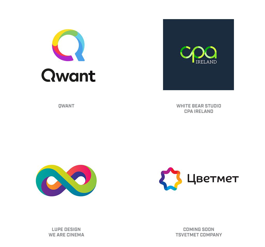
Imagine a line filled with transitioning color to demonstrate motion, or transformation, or a process. Now take that color and step divide it with sequential solid tone. Basically a stepped ombre effect–but utilized in a channel as opposed to a field. The Qwant identity achieves this with contoured color breaks that really simulate a gradient to good effect versus CPA, which shows color transition with quartered geometric breaks along the path. Note the infinity loop for Virtual Reality cheats this trend a bit with the use of breaks and very subtle gradient shifts.
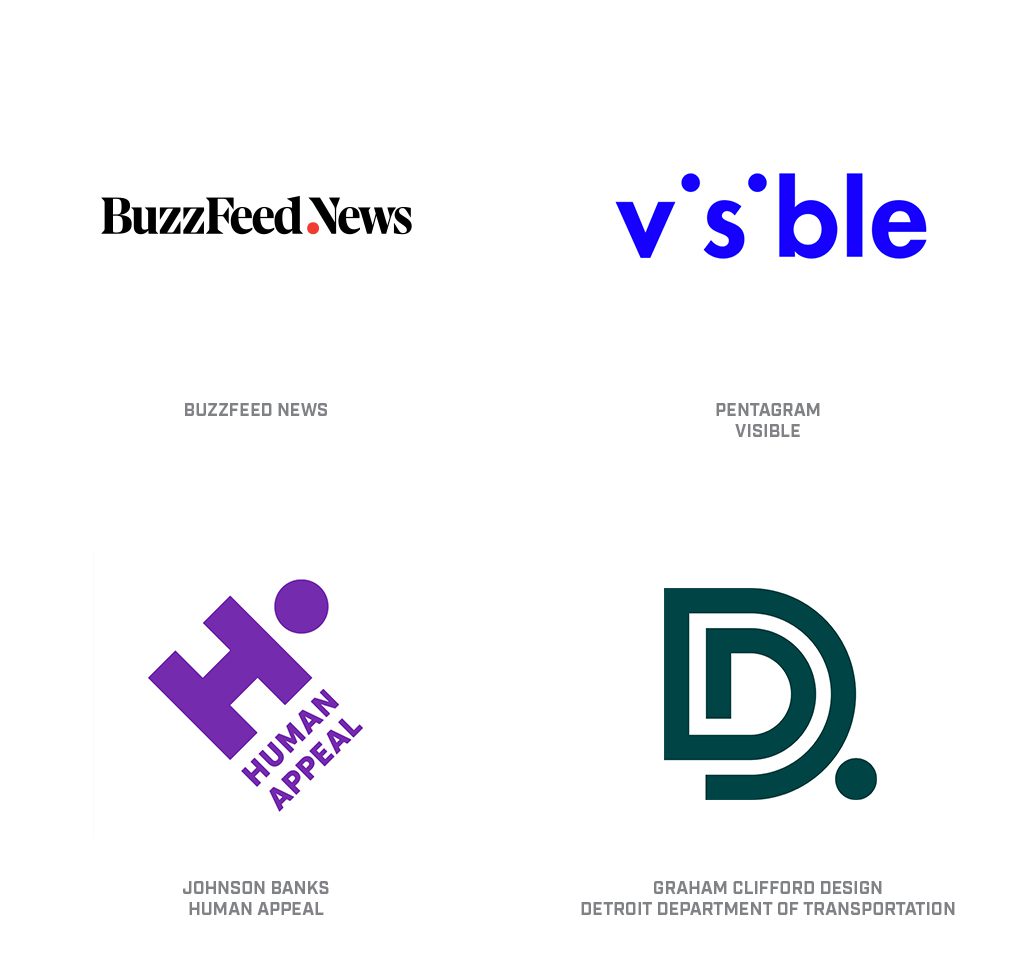
As I contemplated this trend, I was forced to choose between periods and colons that have both been breeding like rabbits on thoughtful designers’ minds. Last year’s report addressed the use of punctuation associated with wordmarks in clever renditions, and as is usually the case, it was only the initial volley that turned to critical mass for each of our two contenders. As the header makes clear, periods won out–so let’s get to it. That speck at the end of a sentence is only the most basic way to consider this mark that can cap off punctuation, serve as a bullet, or string together an ellipse. It can serve as the opening of a domain or as the closing of a conversation.
It’s also possible the period is no more than a dot that’s floating around text with an altogether different pretext. In the Visible mark, those periods are actually remnants of the missing letters “i.” A period in literal terms describes an era of time, the division of a school day or a game, that time of the month, or command to STOP. It might be a decimal, and an exclamation mark–without it is just an apostrophe. It’s the designer that flips the significance of a word or a name by considering the period outside of traditional context that sharpens the wit of the conversation.
Check out the full report on LogoLounge.com.
Bill Gardner is the president of Gardner Design and founder of LogoLounge.com, a repository site where members can post their logo design work and search the works of others by keyword, designer’s name, client type, and more.
Need a creative partner
for your next big idea?